
As of this writing, mind-reading technology doesn’t exist. Which is a shame for traders who want to know what other traders are thinking about a stock. Candlestick charts offer something of a workaround. These charts give you a quick view of the open and close, the high and low, and the direction of a stock over a given length of time — and in doing so hint at other traders’ sentiment about it. Here’s a quick, painless, and (we hope!) very helpful breakdown:
Candlestick anatomy basics
Candlesticks are a part of an asset’s candlestick chart (essentially a fancy bar chart). Each “bar” in the chart is a “candlestick.”
A candlestick represents a specific period of time, and you can customize the timing to your liking — a week, a day, an hour, 5 minutes — really, whatever!
The wax part of the candle is called the “real body.” The ends of the body are what show the open and close price. The thin lines that stick out above and below the candle’s real body are its “wick” and “shadow.” Some people call both of these lines wicks or shadows. We’ll call the line above the wick and the line below the shadow to keep it simple. The top of the wick shows the highest price and the bottom of the shadow shows the lowest price it hit.
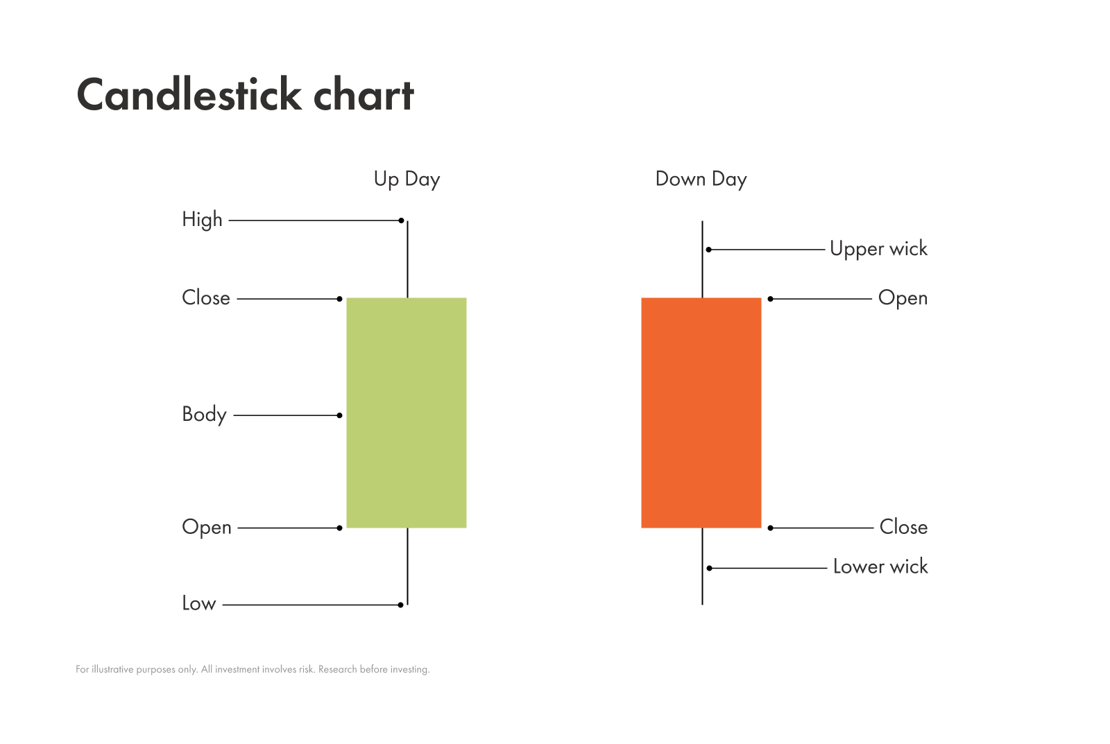
A candlestick’s colour tells you in which direction a stock moved: a green or white means a stock closed higher than it opened; a red or black candlesticks signals the stocks closed lower.
Candlestick patterns and market sentiment
The real benefit of a candlestick chart is that, when you view all the individual candlesticks side by side, they help reveal the market’s mood.
The main market sentiments you can determine from candlestick patterns are bullish, bearish, or neutral. We go into detail below, but the gist is that chart patterns signal whether buyers or sellers have control, indicate potential price direction, and can reveal market indecision during sideways periods.
Bullish patterns
Suggest that buyers are taking control
Can signal a potential upward move / a shift towards optimism
Bearish patterns
Suggest that sellers are gaining strength
Can warn of a potential downward move / a shift towards pessimism
Neutral patterns
Indicates indecision
Seems like no one is in charge
The market is likely to stay in a sideways range until a clearer signal emerges
Here’s a quick example:
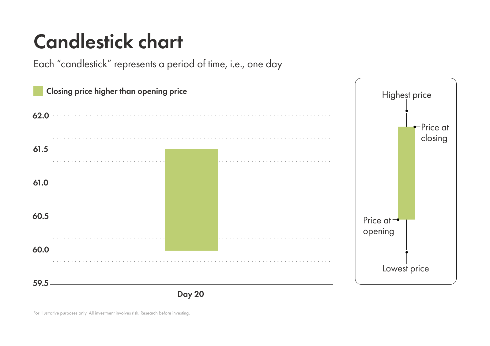
This candlestick tells us its:
Open: 60.00
Close: 61.50
High: 62.00
Low: 59.50
Direction: Bullish
OK, does that sort of make sense? Well, buckle up because there are lots of popular candlestick patterns among traders. Here are a few common ones:
Common bullish candlestick patterns
Hammer
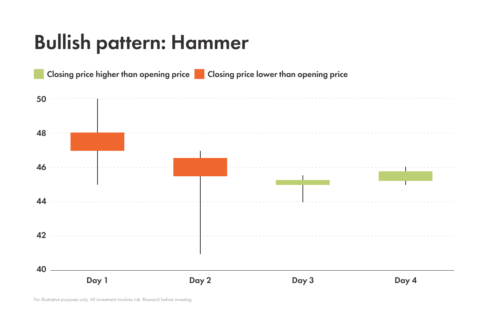
Key features
Number of candles: 1
Colour: Any
Body: Small; Located at the top of range
Wick: Little to none
Shadow: Very long; At least twice the length of the body
Notes: It resembles an upright hammer - hence the name
Background
The hammer typically appears after a decline.
Its long lower shadow shows that sellers initially pushed the price down, but buyers stepped in aggressively, pushing the price back up close to the open.
This push up from buyers suggests that the price might rise in the future. Some traders see this pattern as a great indicator to buy.
Inverted hammer
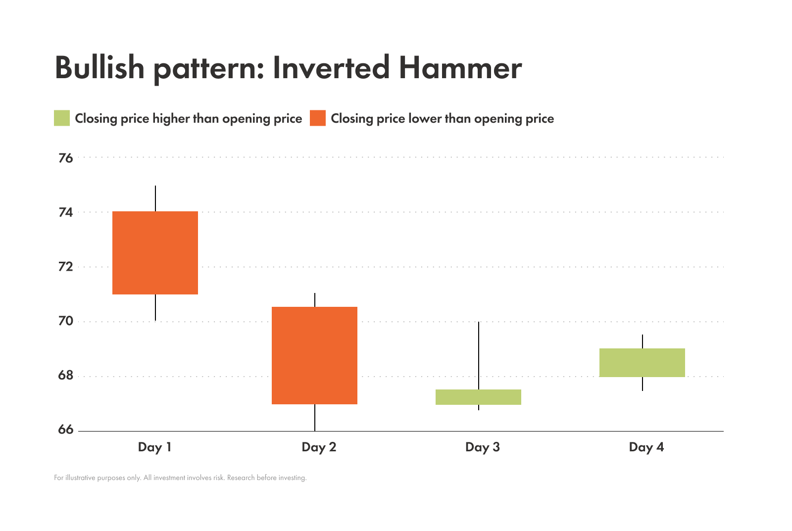
Key features
Number of candles: 1
Colour: Any
Body: Small; Located at the bottom of the range
Wick: Very long ; At least twice the length of the body
Shadow: Little to none
Notes: Looks like the hammer pattern, but flipped upside down
Background
The inverted hammer pattern typically appears after a downtrend, just like the upright hammer.
Its long upper wick shows that buyers tried to push the price up significantly, but sellers managed to push it back down and closed near the open. Though sellers pushed down the price, the effort from buyers to get the price up means this pattern is still considered bullish. To validate this signal traders can wait to see if a strong, green candle appears next. This helps confirm the suspected upward momentum.
Bullish engulfing
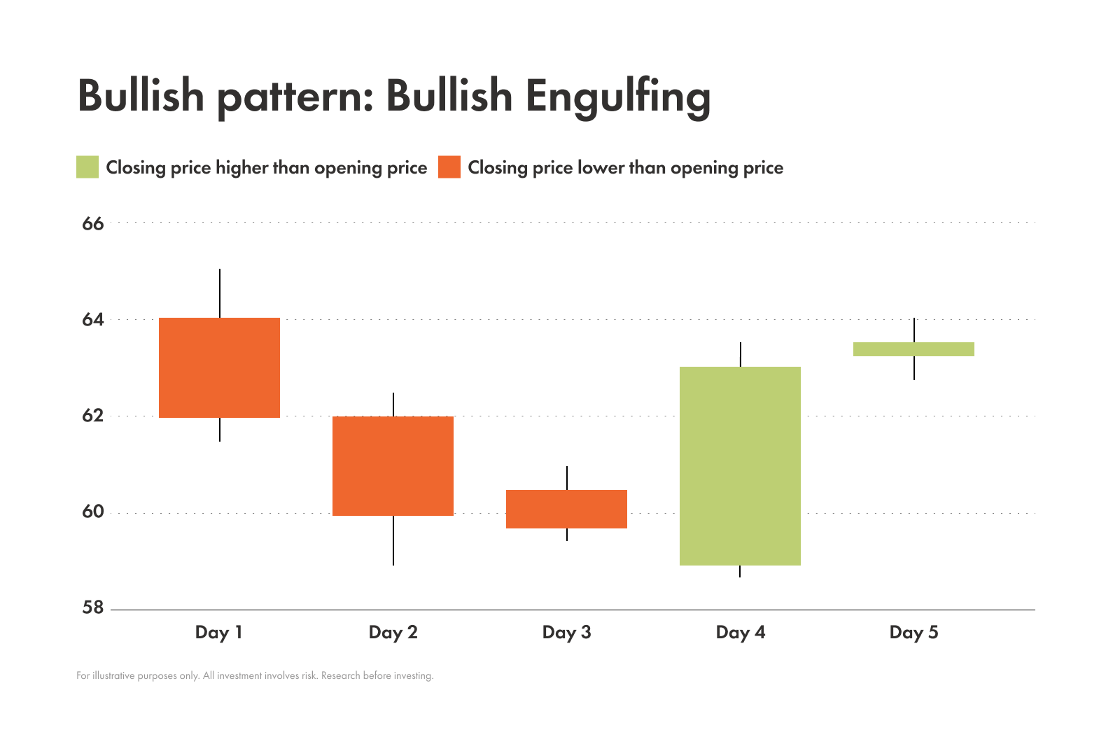
Key features
Number of candles: 2
Candle 1 | Candle 2 | |
|---|---|---|
| Colour | Red / black | Green / white |
| Body | Small | Large; A lower open than the previous candle’s close; A higher close than the previous candle’s high |
| Wick | Any size | Any size; There’s no overlap with the previous candle’s wick |
| Shadow | Any size | Any size ;There’s little to no overlap with the previous candle’s shadow |
Notes: The small bearish candle to the left being completely engulfed by the larger bullish candle to the right, is what gives this pattern its name
Background
This pattern forms during a downtrend.
The small bearish candle shows that sellers are still in control. But the next candle is a huge bullish one. It opens lower than the previous close and closes higher than the previous open.
This signals that a wave of buyers overwhelmed the sellers. It’s a powerful sign that can suggest there’s a reversal on the way.
For a bullish engulfing pattern to be considered reliable, the engulfing candle should have above-average volume.
High volume confirms that a significant number of participants are buying and gives the reversal more conviction.
Morning star
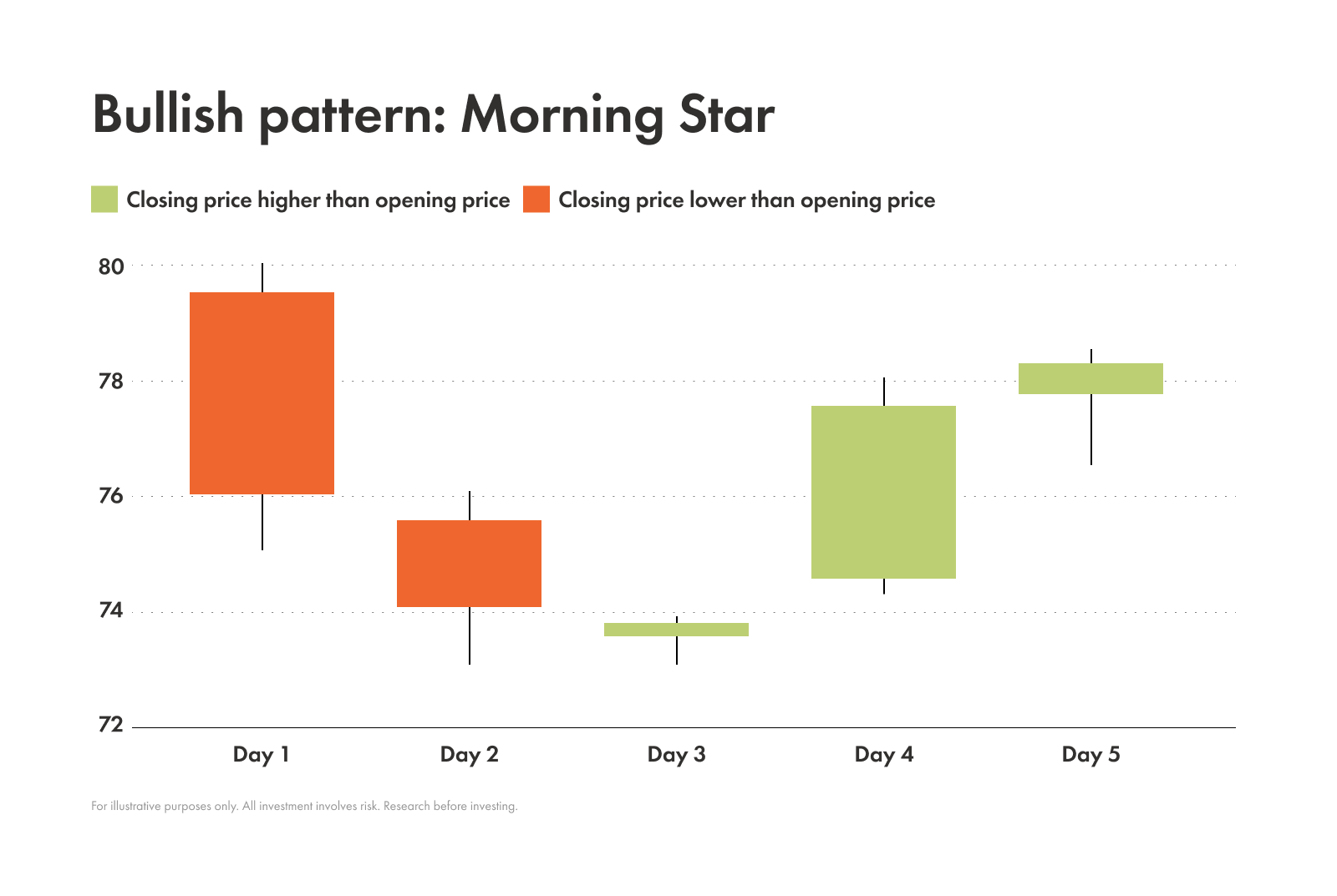
Key features
Number of candles: 3
Candle 1 | Candle 2 | Candle 3 | |
|---|---|---|---|
| Colour | Red / black | Any colour | Green / white |
| Body | Large | Small; Forms at the lower end of the previous candle | Large; At least the same size as the first candle, if not larger |
| Wick | Any size | Little to none | Any size |
| Shadow | Little to none | Little to none | Any size |
Notes: Resembles a setting sun, and a small morning star appearing before daybreak (the bullish candle to the right)
Background
This pattern often appears at the end of a downtrend. When it does, it tells a story:
First candle → sellers are in control
Middle candle (the star) → indecision and a loss of momentum from the sellers
Final bullish candle → confirms the buyers have arrived with force
With the strong push from buyers on the final candle, a reversal is likely in the works.
Strategy-wise, a trader might enter a long position after the close of the third candle with a potential stop-loss of just below the low of the star (or middle) candle. This way they could ride the uptrend while also potentially avoiding major losses.
Piercing pattern
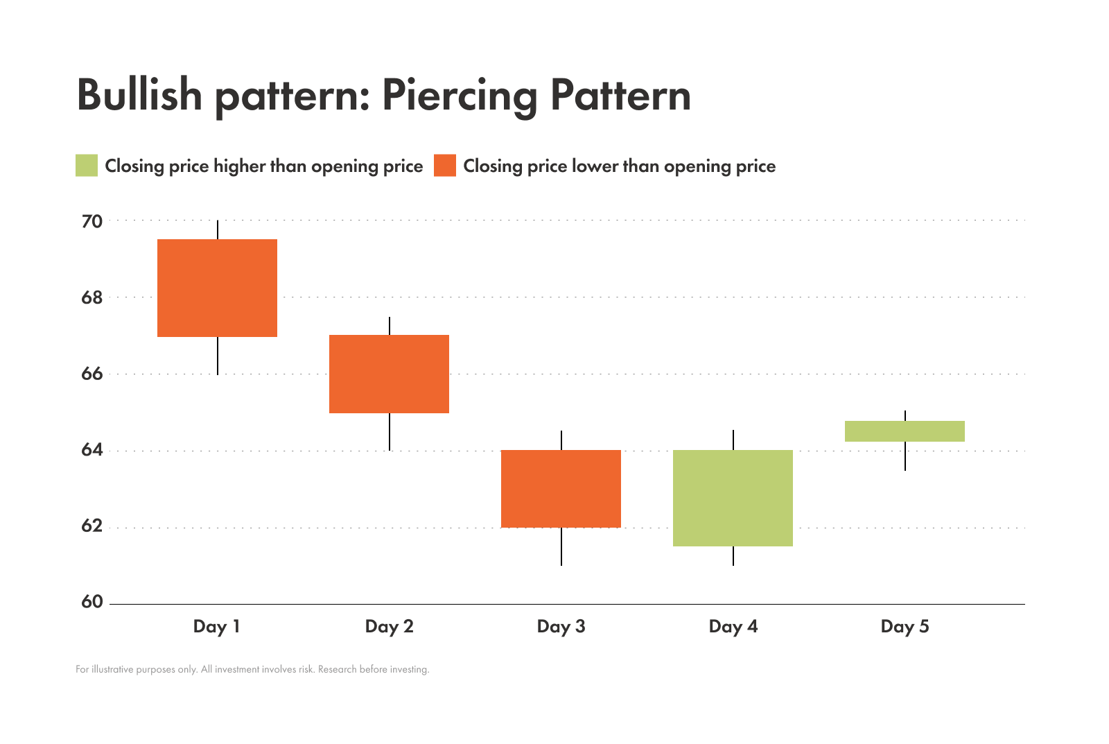
Key features
Number of candles: 2
Candle 1 | Candle 2 | |
|---|---|---|
| Colour | Red / black | Green / white |
| Body | Large | Large ; Opens below the previous candle’s close; Closes at least halfway up the body of the previous candle |
| Wick | Any size | Any size |
| Shadow | Any size | Any size |
Notes: Considered a more reliable pattern when it appears after a long downtrend
Background
This pattern signals that there could be a bullish reversal on the way.
Buyers have pushed the price back up with so much force that they’ve pierced the selling momentum and closed more than halfway into the previous day’s bearish candle.
To confirm that the piercing pattern is going to continue in an uptrend, traders tend to wait for the next candle to open higher than the close of the piercing candle. This helps confirm that the buying pressure is continuing.
Traders might also look for this pattern to appear near a key support level to increase its reliability and make sure to factor in other data (like the overall trend and volume analysis).
Common bearish candlestick patterns
Shooting star
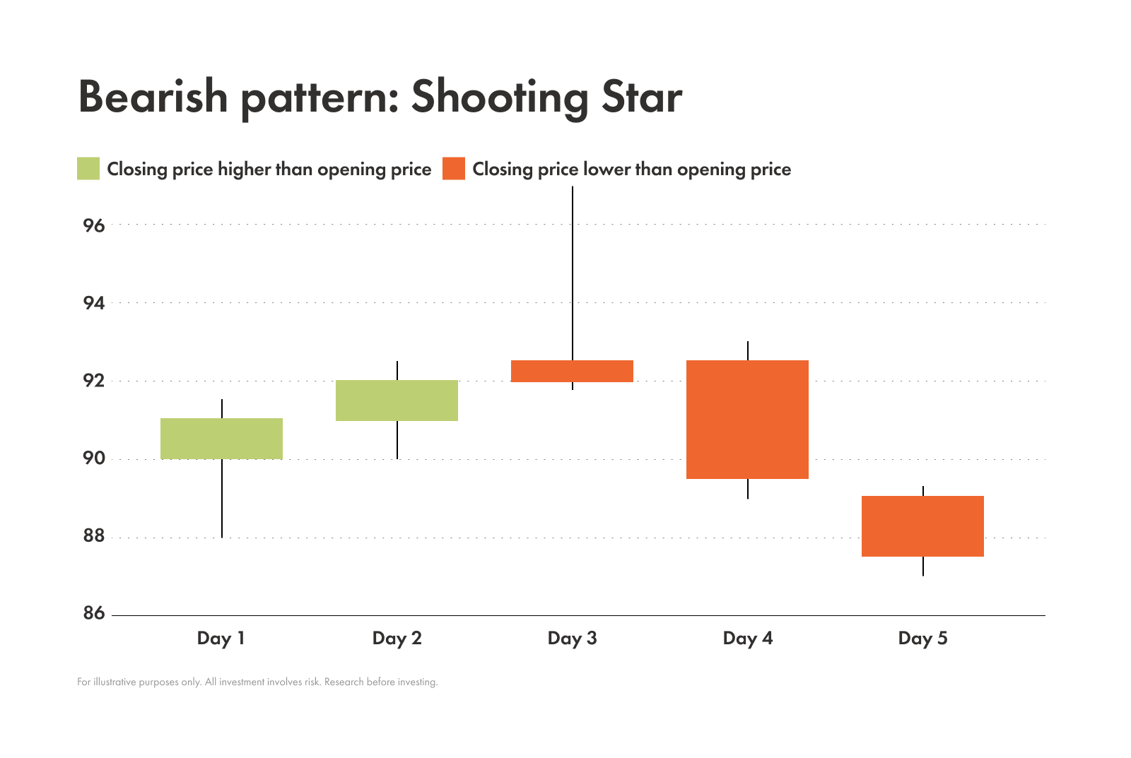
Key features
Number of candles: 1
Colour: Green / white
Body: Small; Located at the bottom of the range
Wick: Very long; Must be at least half of the length of the candlestick
Shadow: Small
Notes: Looks similar to an inverted hammer; What makes this one different is it appears after an uptrend — not a downtrend
Background
The shooting star pattern appears after an uptrend.
The long wick on this pattern shows how buyers tried to push the price higher. But then sellers came in and forcefully pushed down the price so much that it closed near the open.
This can be a signal that buyers are losing steam.
It’s especially strong if it appears at the peak of an uptrend, alongside high volume. That means a lot of people are selling, and only adds more weight to the potential of a reversal.
Bearish engulfing
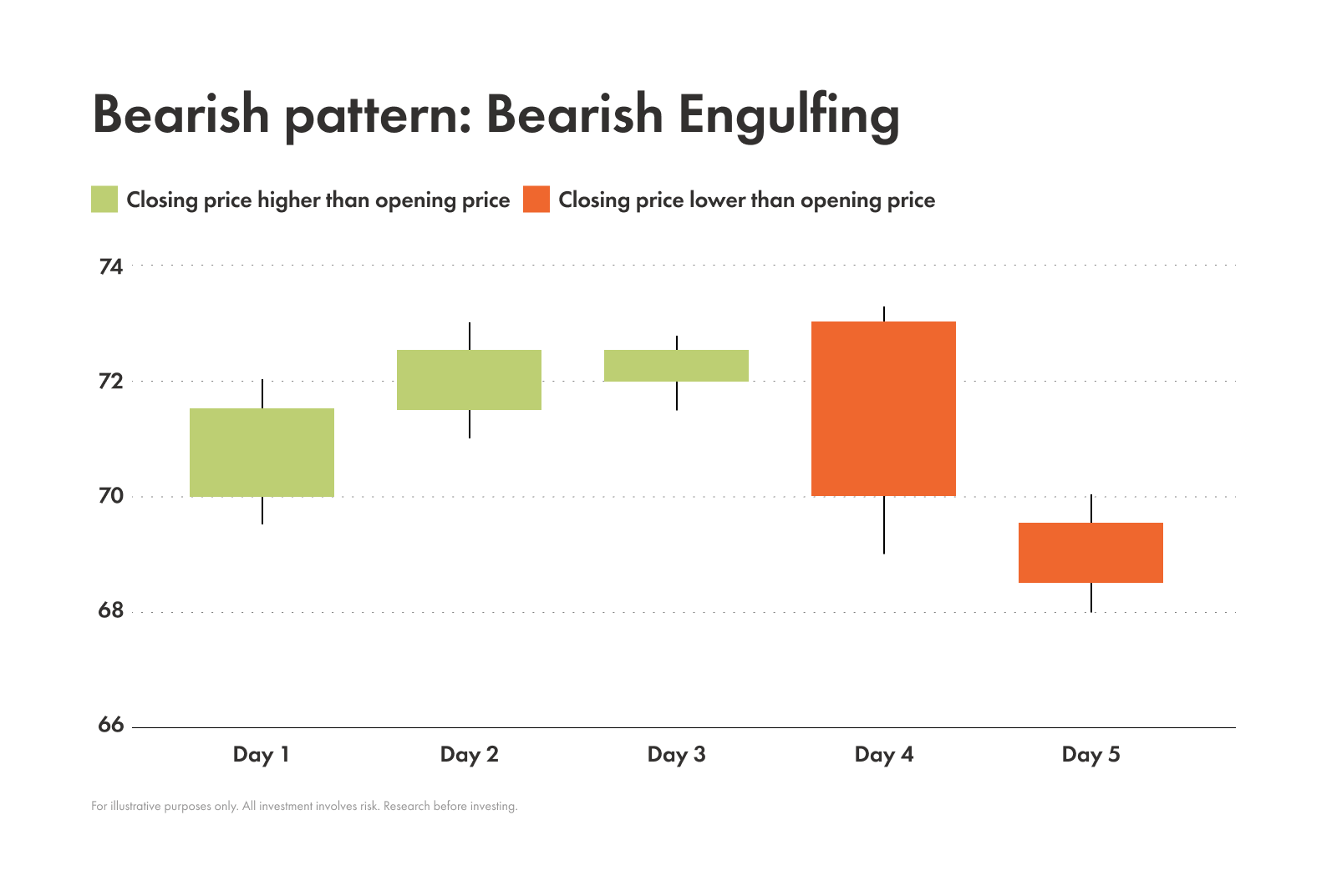
Key features
Number of candles: 2
Candle 1 | Candle 2 | |
|---|---|---|
| Colour | Green / white | Red / black |
| Body | Small | Large; Lower open than the previous candle’s close; Higher close than the previous candle’s high |
| Wick | Any size | Any size; No overlap with the previous candle’s wick |
| Shadow | Any size | Any size; Little to no overlap with the previous candle’s shadow |
Notes: The small bullish candle to the left being completely engulfed by the larger bearish candle to the right is where this pattern gets its name
Background
A bearish engulfing is most powerful when it shows up after a clear uptrend. It’s a warning sign that shows when buying pressure has been overwhelmed by selling pressure.
To get more confirmation on the signal that there could be a downtrend coming, traders tend to look for a lower close on the next day. They also look for confirmation from other indicators, like a drop below a key moving average or a breach of a support level.
Evening star
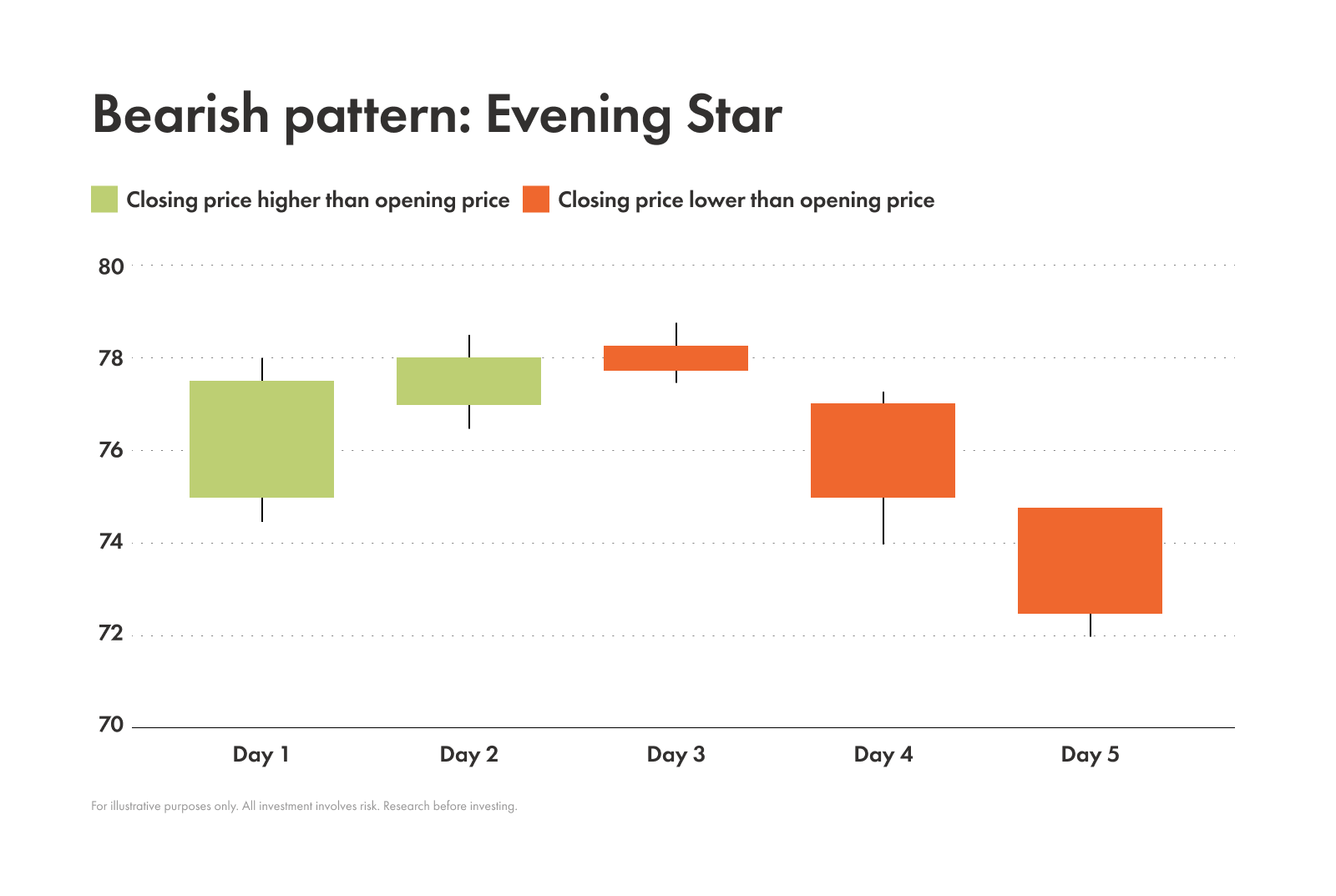
Key features
Number of candles: 3
Candle 1 | Candle 2 | Candle 3 | |
|---|---|---|---|
| Colour | Green / white | Any colour | Red / black |
| Body | Large | Small; Forms at the higher end of the previous candle | Large; The same size as the first candle, if not larger |
| Wick | Small | Little to none | Any size |
| Shadow | Small | Little to none | Any size |
Notes: Looks like an inverted version of the morning star pattern
Background
This pattern often appears at the end of an uptrend and tells a story:
First candle → buyers are in control
Middle candle (the star) → indecision and a loss of momentum from buyers
Final bearish candle → confirms the sellers have arrived with force
With the strong push from sellers, a reversal is likely to happen soon.
When traders in a long position see this pattern they might consider taking some profits or placing a tight stop-loss because this pattern is very likely to come before a reversal.
Dark cloud cover
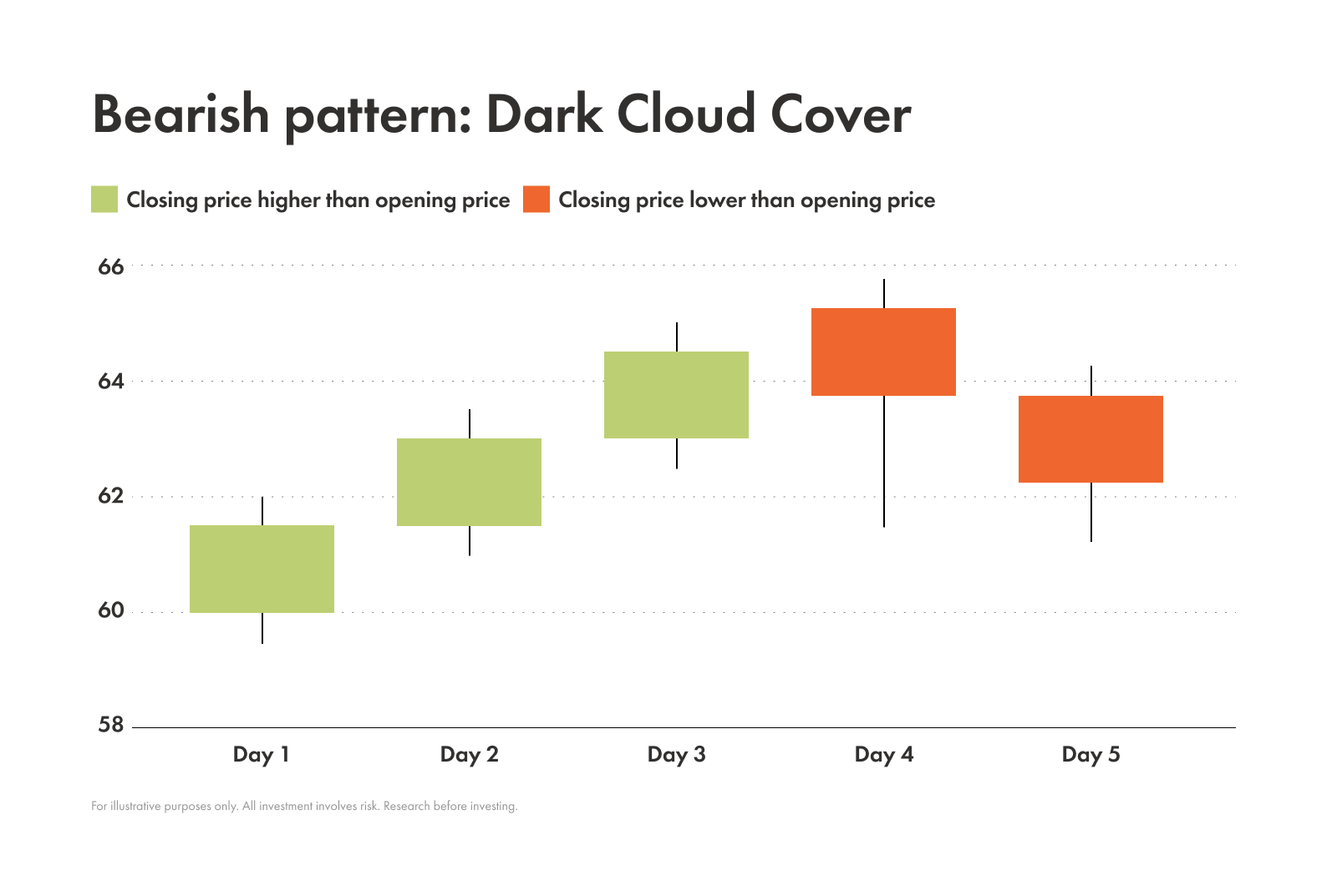
Key features
Number of candles: 2
Candle 1 | Candle 2 | |
|---|---|---|
| Colour | Green / white | Red / black |
| Body | Large | Large; Opens above the previous candle’s close; Closes at least halfway up the body of the previous candle |
| Wick | Any size | Any size |
| Shadow | Any size | Any size |
Notes: Considered a more reliable pattern when it appears after a long uptrend
Background
Dark cloud cover suggests that a bearish reversal could be up next.
In this pattern the price opens with a huge surge of optimism. But, by the end of the period, sellers have taken over and forced the price back down — covering more than half of the previous day’s gains!
It’s a stronger signal if it happens at or near a key resistance level (especially one that has been respected in the past). It has even more weight behind it if the stock's price is also trading below a moving average, like the 50-day or 200-day simple moving averages.
Hanging man
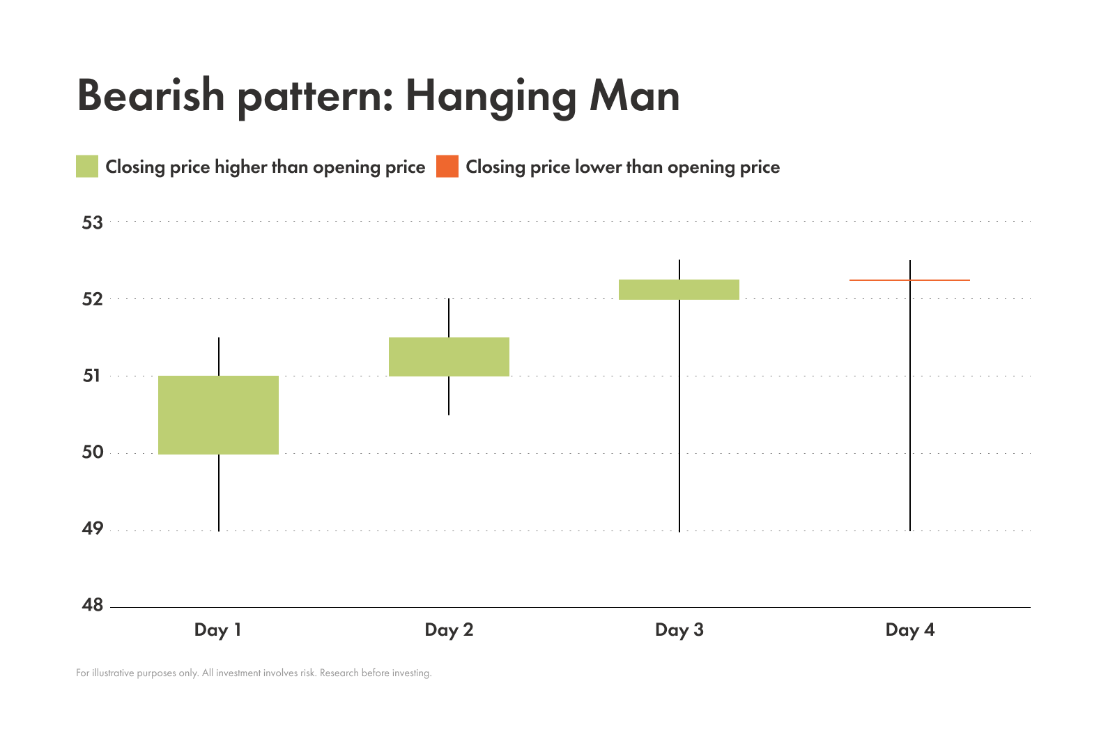
Key features
Number of candles: 1
Colour: Any
Body: Small; Located at the top of the range
Wick: Little to none
Shadow: Very long; At least twice the length of the body
Notes: Looks similar to a hammer; What makes this one different is it appears after an uptrend — not a downtrend
Background
A hanging man pattern is a bearish signal that appears after an uptrend. This means that sellers pushed the price down and, because it’s happening after an uptrend, it looks like the buying momentum is fading.
If this pattern shows up in the middle of a choppy, sideways market it means very little. But if it appears at a new high after a strong, steady uptrend it’s a serious warning sign.
How to use candlestick patterns in trading
Traders usually don’t use candlestick patterns in isolation but instead rely on them as part of a larger research strategy.
Combine with other tools
Trend analysis
Are you in an uptrend, downtrend, or sideways market?
A bullish pattern in an uptrend can be a powerful sign of continuation. But, the same pattern in a downtrend is a signal of a potential reversal.
Support and resistance
When a bullish pattern forms on a key support level it’s a much stronger signal.
Likewise, a bearish pattern at a resistance level is a major red flag.
Indicators
You can use technical indicators like moving averages, the Relative Strength Index, or the Moving Average Convergence/Divergence to help confirm your patterns.
The importance of confirmation
Just like the first two rules of Fight Club, you should also remember the first two rules of candlestick patterns:
Never trade a pattern in isolation.
Always wait for a confirmation candle.
A confirmation candle is the next candle that confirms the direction the pattern is signaling.
For example, after a hammer pattern forms, you want to see a strong green candle appear next before you even think about entering a trade.
Choosing appropriate time frames
Candlestick charts can be customized to any time frame, so pick one that matches your trading style.
Doing long-term investing? Focusing on daily and weekly charts can be a good place to start.
Hoping to use candles for day trading? You might want to try 15-minute or 1-hour charts.
Common mistakes when trading candlestick patterns
Even the best of us can get caught up in charts and patterns. So before diving in, here are some common traps to avoid:
Trading patterns in isolation. Resist the urge to act immediately. Confirm the pattern with a subsequent candle and other indicators.
Ignoring overall market context. Candlestick charts reflect what's happening with a specific asset, but not the market sentiment. A great bullish pattern might fail if the broader market is in a deep downtrend. It’s important to always keep an eye on the bigger picture.
Misinterpreting patterns in low-volume conditions. A pattern that forms with very low volume means very little. Why? Because you don’t have the scale to see real trends. The greater the trading volume, the more you’re able to see how people are feeling about the asset.