Want a clearer way to interpret market price movements? While no chart can predict the future, learning to read charts using technical analysis can help you make more informed decisions.
These charts are essential sources of important data and tools that help enable investors to make informed decisions. In this guide, we'll cover three common chart types and how to read them, several common chart patterns, three widely used technical indicators, and how to choose a timeframe that matches your goals.
What are technical analysis charts?
Technical analysis charts are visual tools that display a stock's historical price movements and trading volume over time. If you've ever seen a chart with a line that zig-zags up and down from left to right, you've seen one in action.
They show how a stock's price has changed over time (an historical record of buyer and seller behaviour) and, depending on the chart type, can include information like:
Opening price
Closing price
Highest price
Lowest price
Trading volume
Traders and investors use these charts to identify patterns, trends, support levels, and resistance levels. If you're not sure what these terms mean, here’s a technical analysis glossary. There are a number of different chart types that show different kinds of data. Picking which one to use depends on two things: what you're trying to figure out and the level of detail you need.
The three most common technical analysis charts are a great place to start: line charts, bar charts, and candlestick charts.
How to read a chart at a glance
Before you choose a specific chart type, it helps to know the anatomy of what you're looking at. Most charts share a few standard features that orient you in the market.
The axes
The horizontal line at the bottom (x-axis) always represents time, moving from the past on the left to the present on the right. The vertical line on the side (y-axis) represents the price.
Volume
You'll often see vertical bars running along the very bottom of the chart, separate from the price action. This is volume. It tells you how many shares were traded during that specific time interval. Taller bars mean more activity, which often suggests a stronger trend.
Price scales
You might see options for "linear" or "logarithmic" (log) scales. A linear scale shows movement in dollar units and treats price changes in equal segments (moving from $10 to $20 looks the same in the chart as moving from $100 to $110 because they are both a $10 increase). A log scale shows movement in percentages and also shows changes in equal segments (moving from $10 to $20 looks the same in the chart as moving from $100 to $200 because both moves are a 100% increase). Log scales are often preferred for looking at long-term trends as they highlight proportional changes in price more effectively.
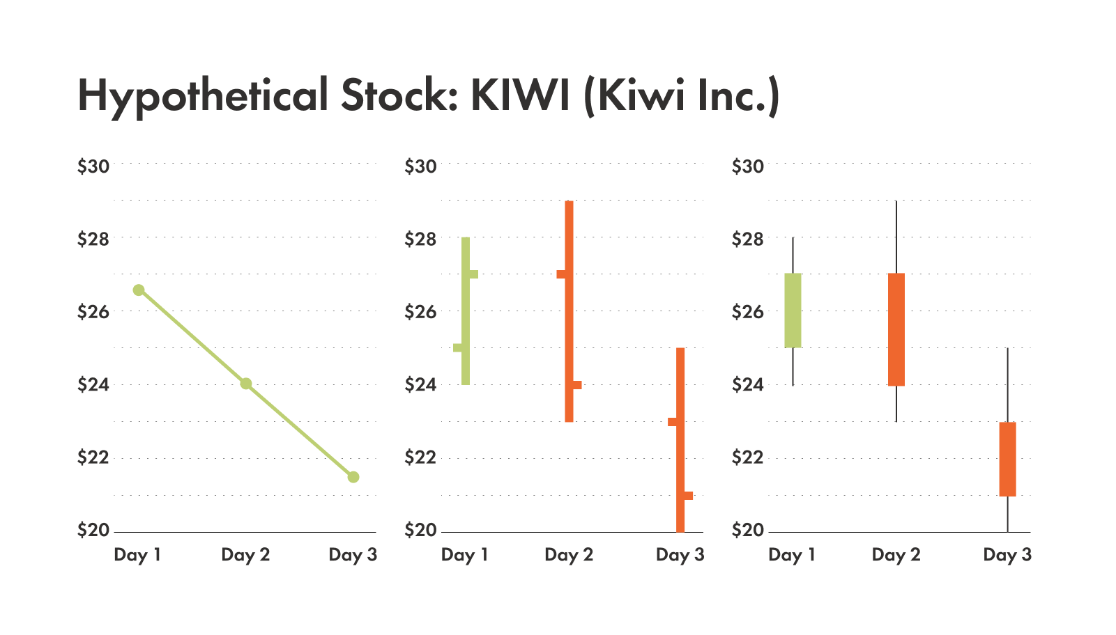
Line charts
The line chart is simple and focuses on the overall price trend.
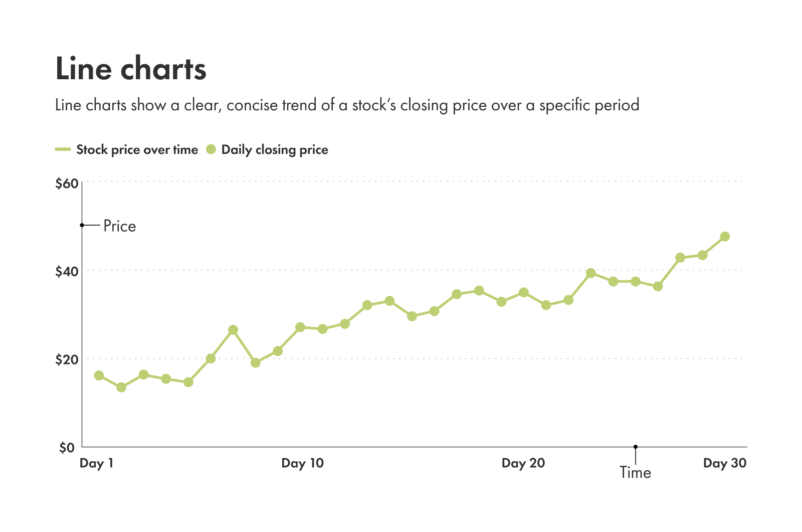
Here's how to read line charts:
X-axis: represents time
Y-axis: represents price
Data points: show the closing price on specific dates
The connecting line: reveals how price changes over time
Goal: show a clear, concise trend of a stock's closing price over a specific timeframe.
Who it's for:
Long-term investors
Anyone looking for an overview of a stock's price over time
What it's for:
A quick look at the overall direction of a stock
A simplified way to compare different companies
An easy way to spot long-term trends
Pros and cons of line charts
Pros:
Easy to read
Highlights the overall trend
Reduces "noise" compared with more detailed charts
Cons:
Provides less detail
Can obscure short-term volatility
Bar charts
The next level of chart (in terms of detail) is a bar chart. Also called open, high, low, close (OHLC) charts, they have more information than a line chart while remaining relatively easy to scan.
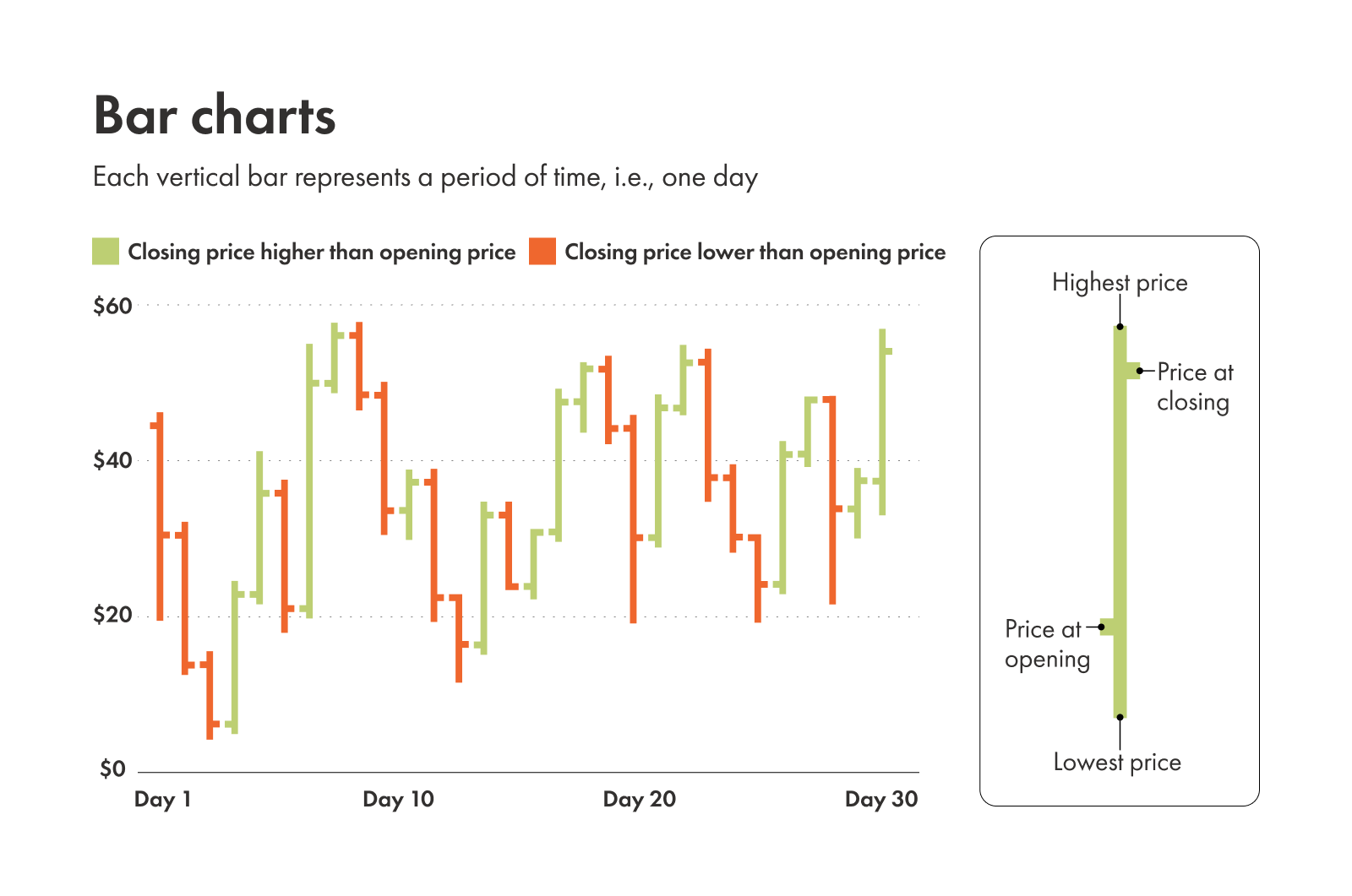
Here's how to read them:
Each vertical bar: represents a timeframe
Left horizontal tick: shows the opening price
Right horizontal tick: shows the closing price
Top of the bar: highest price for that session
Bottom of the bar: lowest price for that session
Goal: display the open, high, low, and close prices for a specific interval.
Who it's for:
Anyone looking for more information than a line chart offers
Traders looking for the range of price movements over time
What it's for:
Helps traders spot trends for stocks over a longer timeframe
A helpful tool for slightly more detailed short-term price analysis
Pros and cons of bar charts
Pros:
Provides more price information (open, high, low, close) than a line chart
Shows the range of price movement within a session
Cons:
Can be less intuitive to read than a line chart
Less visually engaging than a candlestick chart
Candlestick charts
Candlestick charts provide more detail than line charts and are widely used in technical analysis.
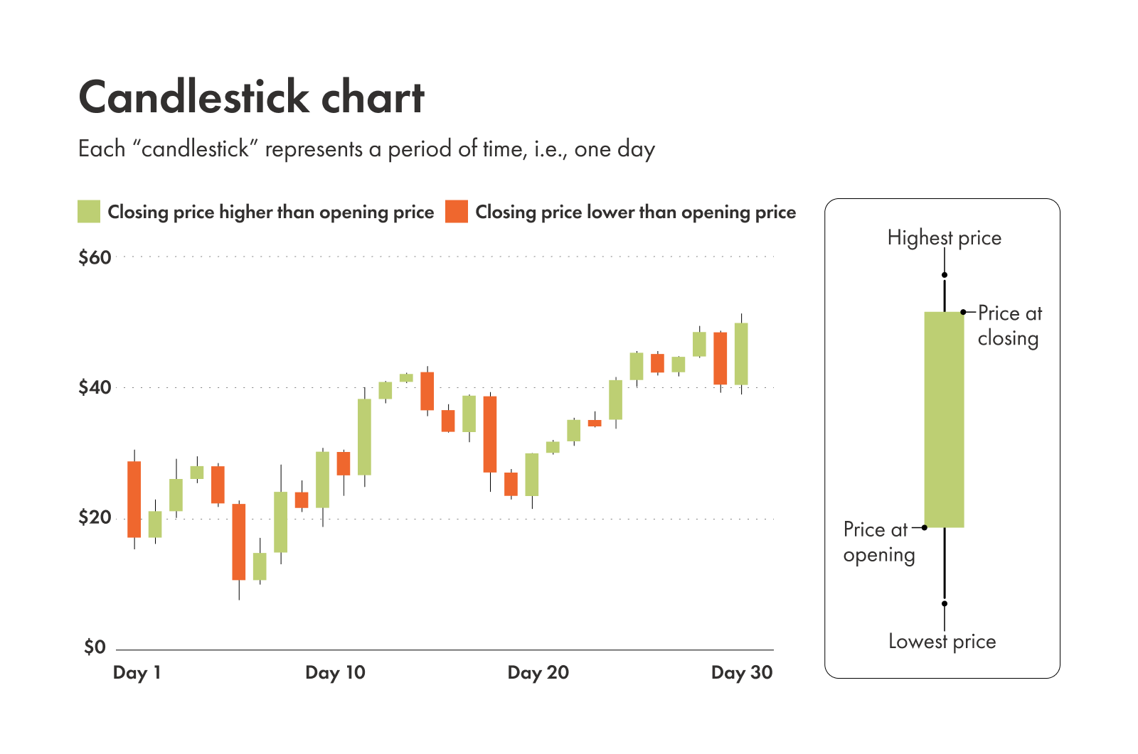
Here's how to read candlestick charts:
Each candlestick: represents a time interval
Real body (wide part): shows the difference between opening and closing price
Wick (line above): shows the highest price during the candle interval
Shadow (line below): shows the lowest price during the candle interval
Green or white candles: closing price higher than opening (price went up)
Red or black candles: closing price lower than opening (price went down)
Goal: show price movement in a comprehensive way (including the open, high, low, and close), while also using colour coding and a thicker candle "body" to show trends quickly.
Who it's for:
Anyone who wants a wealth of information quickly
Investors timing when to buy or sell a stock
What it's for:
Identifying price patterns that may signal reversals or trend continuation
Helping you plan potential buy and sell decisions
Pros and cons of candlestick charts
Pros:
Visually rich, with colour coding and lots of data points
Easy to interpret once you know the basics
Helps with identifying trends and reversals
Cons:
Can appear overwhelming to new users
Learning is required to understand trends and find them
Compare technical analysis charts
Comparing these chart types side by side highlights how much price detail each one shows, particularly the differences between candlestick and bar charts. You can also see a visual example below.
Line chart | Bar chart | Candlestick chart | |
|---|---|---|---|
| Data | Closing prices | Open, high, low, and closing prices | Open, high, low, and closing prices; Buying and selling pressure |
| Best for | Long-term trend spotting; Comparing multiple stocks; Seeing overall market direction | Medium-term analysis; Intraday (within the day) analysis; Identifying trend strength; Understanding price range within a period | Short- to long-term analysis; Pattern analysis; Timing entries and exits; Identifying price patterns and market sentiment |
| Pros | Simple; Clean | Shows full OHLC | Visual; Widely used |
| Cons | Lacks detail | Can be hard to read | Steeper learning curve |
Common chart patterns to know
Once you can read the price action, you might start noticing shapes that repeat. Traders call these patterns, and they use them to make educated guesses about where the price might go next.
Pattern | What it looks like | What it suggests |
|---|---|---|
| Support and resistance | Price levels that act like floors (support) or ceilings (resistance) | Areas where price has trouble breaking through |
| Trendlines | Straight lines connecting highs or lows | Upward = uptrend; downward = downtrend |
| Head and shoulders | Three peaks with a higher middle peak | Upward trend may reverse downward |
| Double tops | Letter "M" shape | Price might fall |
| Double bottoms | Letter "W" shape | Price might rise |
Support and resistance
Think of support as a floor and resistance as a ceiling. Support is a price level where a stock has historically had trouble falling below, while resistance is a level it struggles to break above. Traders use these levels to identify potential entry and exit points.
Trendlines
By connecting a series of highs or lows with a straight line, you can spot a trend. An upward line connecting higher lows suggests an uptrend, while a downward line connecting lower highs suggests a downtrend. Trendlines clarify the overall direction of price movement.
Head and shoulders
This pattern looks like three peaks: a higher peak (the head) between two lower peaks (the shoulders). It's often seen as a signal that an upward trend is about to reverse and head down. Traders watch for this pattern to anticipate potential reversals.
Double tops and bottoms
A double top looks like the letter "M" and suggests a price might fall. A double bottom looks like a "W" and suggests a price might rise. These patterns indicate potential trend reversals after the price tests a level twice.
Popular technical indicators and what they mean
Indicators are calculations based on price and volume data that support trend confirmation. Here are three commonly used ones:
Moving average (MA): smooths price fluctuations to show trend direction
Relative strength index (RSI): measures whether a stock may be overbought or oversold
Moving average convergence divergence (MACD): identifies changes in trend strength and momentum
Moving average (MA)
This line smooths out price fluctuations to show the average price over a set timeframe (like 50 days or 200 days). It helps you see the general direction of the trend without the distraction of daily spikes.
Relative strength index (RSI)
The RSI measures the speed and change of price movements. It's a scale from 0 to 100. Generally, if the RSI is above 70, a stock might be "overbought" (expensive). If it's below 30, it might be "oversold" (cheap).
Moving average convergence divergence (MACD)
This indicator helps identify changes in the strength, direction, momentum, and duration of a trend. It involves two lines moving around a centre line, and traders watch for when these lines cross each other.
How to pick a timeframe for charts
Selecting a timeframe is how you zoom in or out of different sections on the chart you're analysing. You can customize technical analysis charts over different time periods depending on what you're looking for. Here are some examples:
Daily: each point, bar, or candle represents one trading day. Great for swing traders who typically own stocks for a few days to several weeks with the intention of profiting from short-term trends of price swings.
Weekly: each point, bar, or candle represents one trading week. Ideal for long-term investors to identify major trends, as weekly charts tend to filter out daily "noise" and show clearer signals.
Hourly (or less): each point, bar, or candle represents one hour (or even less, at every minute or every 5 minutes). Made for very active traders, like day traders, who need to see minute-by-minute price action.
The timeframe you choose heavily influences what you see and how you interpret the chart, so it's crucial to align it with your investment goals. Many analysts use multiple timeframes — for example, a daily chart for the overall trend and a 1-hour chart for entry/exit points — to get a comprehensive view.
Where technical analysis helps and where it doesn't
Technical analysis uses historical price and volume data to assess trends, but it cannot predict future results.
Charts are excellent for helping you decide when to buy or sell a stock you're interested in (timing) and for setting rules to limit your losses (risk management). However, charts don't tell you about the fundamental health of a company, like its earnings, management team, or new products. That's why many investors use a mix of both technical and fundamental analysis.
Understanding different types of technical analysis charts and how to read them can improve how you interpret price and volume data. Charts can't predict the future with absolute certainty, but they can give you a great sense of the market's pulse. With practice, you can use charts to support more structured trading and investing decisions.