Identifying trends using technical analysis can help you spot opportunities like a pro.
An old market adage is, "The trend is your friend." While friendships can sometimes be complicated, this one isn't. Finding the trend helps traders align with market momentum, and in a sense, surf the market waves.
What a trend is in technical analysis
In the technical analysis world, a "trend" is the general direction a stock's price is moving in. Similar to the idea of drawing supply and demand lines, spotting trends helps to paint a picture of where things might be headed. There are three main types:
Uptrend: prices are generally moving higher. Buyers are in the driver's seat.
Downtrend: prices are generally moving lower. Sellers are calling the shots.
Sideways or ranging: prices are relatively stable, moving in a horizontal direction. Like a buyer and seller tug-of-war.
It’s important to remember that trends exist on different timeframes. A stock might be in a long-term uptrend on its weekly chart but in a short-term downtrend on its daily chart. It's like looking at a mountain range (long-term) versus a specific hill within it (short-term). Day traders might focus on hourly trends, while long-term investors might look at monthly or yearly trends.
Types of market trends
Let's get to know these trend types a bit more:
Uptrend
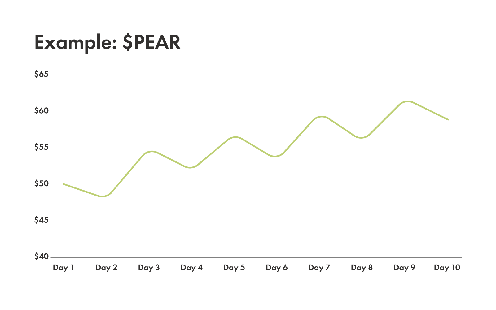
When the stock price consistently makes higher highs and higher lows. It can look like a staircase leading upward – each step is higher than the last – suggesting that buyers are more enthusiastic and are pushing prices up.
Example: stock PEAR hits $50, drops to $48, then rises to $55, drops to $52, and so on. The peaks ($50, $55) are getting higher, and the valleys ($48, $52) are also getting higher. That's an uptrend.
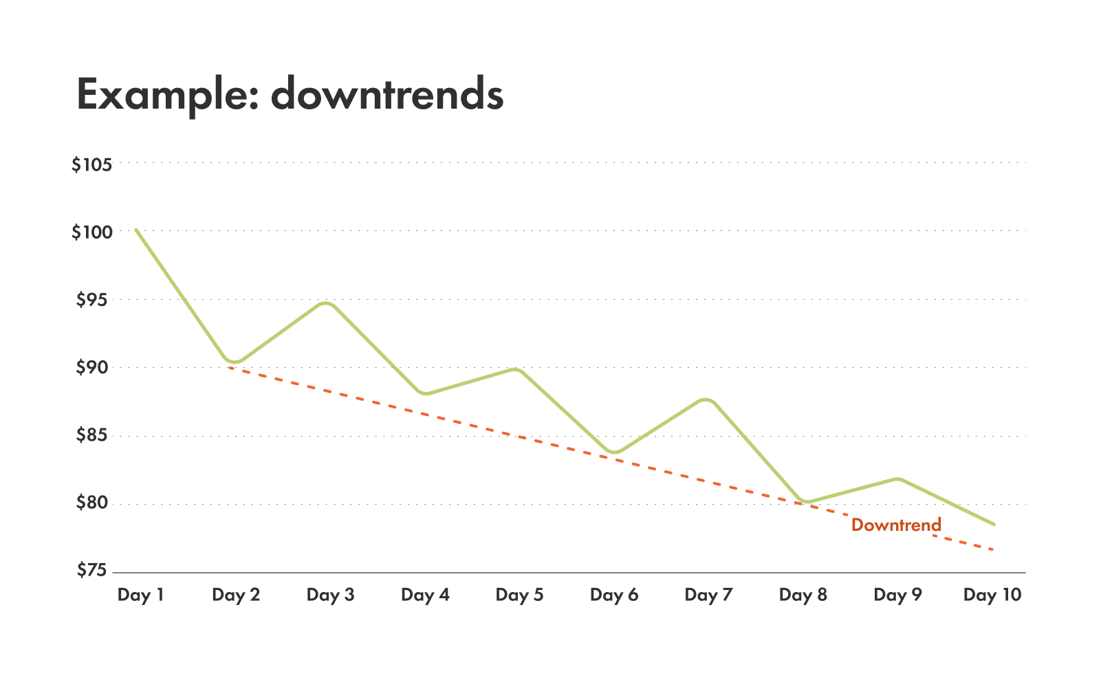
Downtrend
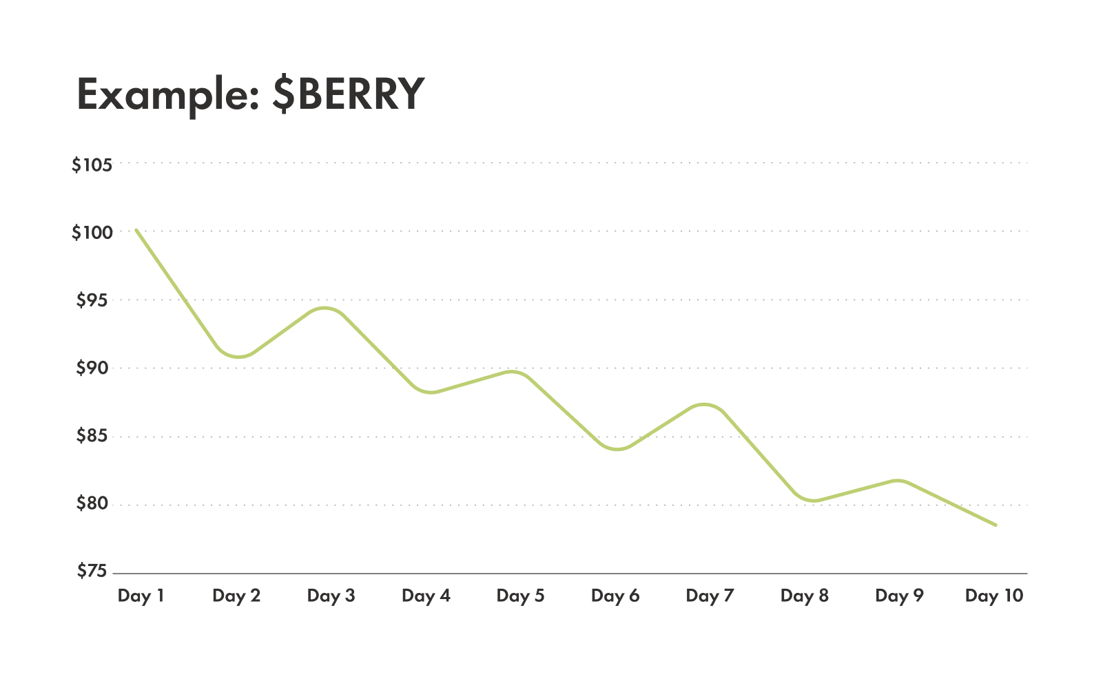
When stock prices make lower highs and lower lows. It can look like a staircase leading downward. Sellers are dominating, which is pushing prices down.
Example: stock BERRY starts at $100, falls to $90, bounces up to $95, then falls down to $88, and so on. The peaks ($100, $95) are getting lower, and the valleys ($90, $88) are also getting lower. That’s a downtrend.
Sideways or ranging
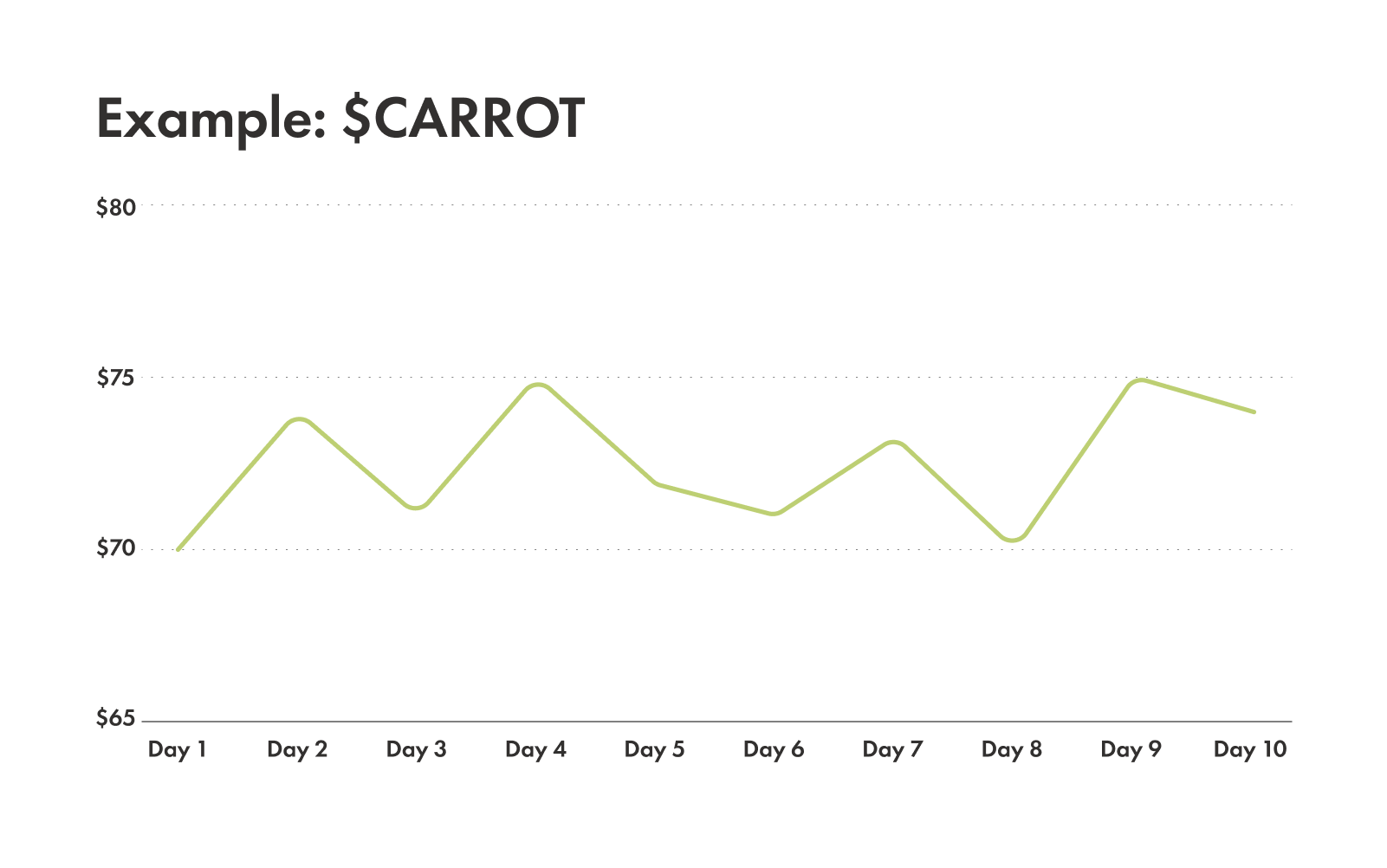
This is when the price goes in a relatively horizontal range — like a ping-pong match where the ball stays between two lines. Neither buyers nor sellers are pushing the price decisively in one direction. This often signals a period when the market is catching its breath before breaking out into a new trend.
Example: stock CARROT hovers between $70 and $75 for weeks. It might touch $70, go up to $74, fall to $71, then back up to $75. It's staying within that narrow band.
How to draw trendlines
Drawing trendlines is one of the most powerful tools in your technical analysis toolkit. They help visualize the trend and identify potential support or resistance levels.
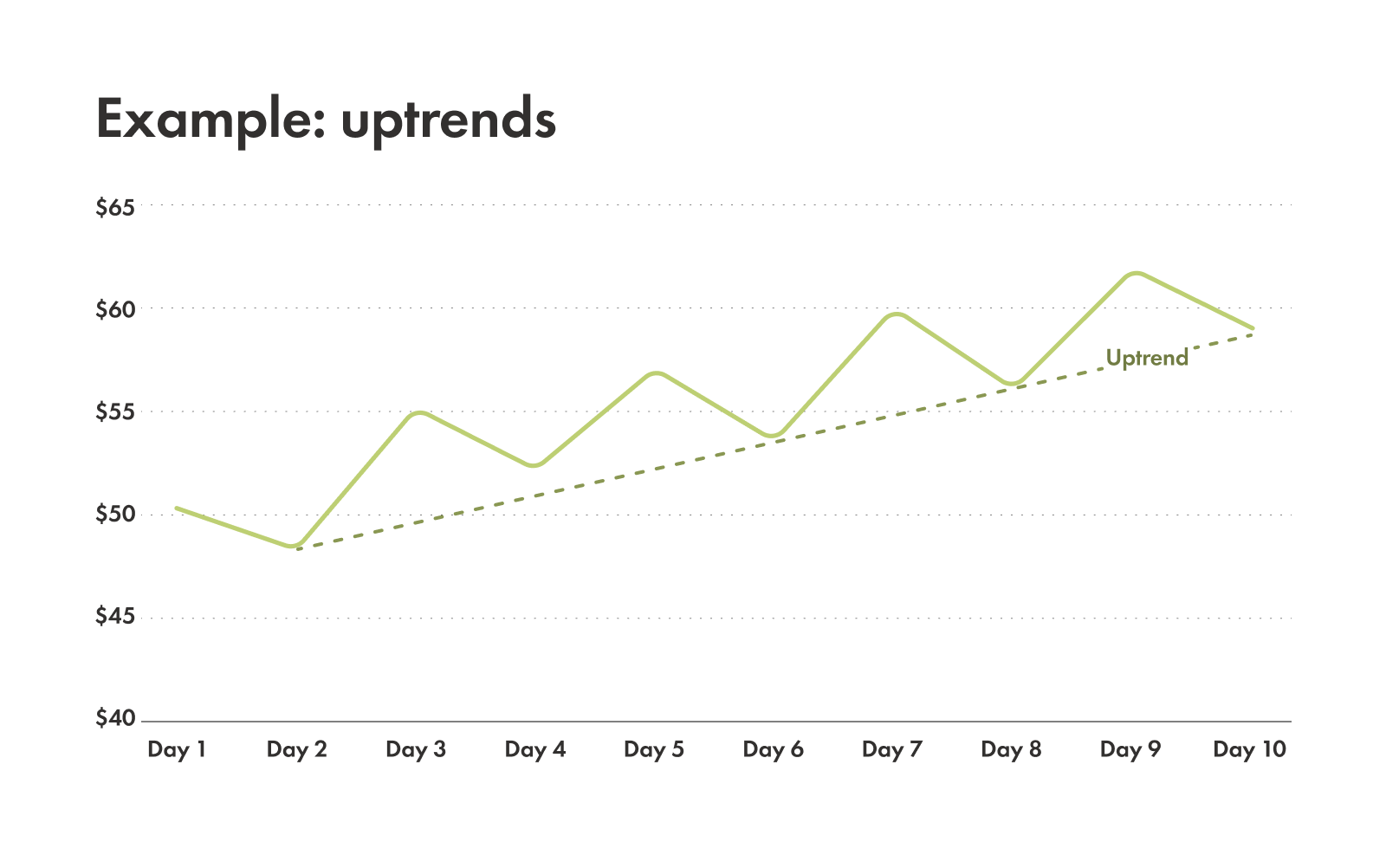
Drawing an uptrend
You connect at least two (and ideally more) rising lows with a diagonal line. This line acts as dynamic support, meaning the price often bounces off it as it moves higher.
Doing it right: imagine connecting the low points of those "steps" in our uptrend staircase. The line should follow the general upward path of the price.
Doing it wrong: don't try to force a line. You're looking for the natural "floor" of the trend.
Drawing a downtrend
You connect at least two (and ideally more) falling highs with a diagonal line. This line acts as dynamic resistance, meaning the price often hits it and then moves lower.
Doing it right: connect the peak points of those "steps" in a downtrend staircase. The line should follow the general downward path.
Doing it wrong: avoid connecting low points or trying to force a line where it doesn't naturally belong.
Trendlines can tell us a lot because they act as dynamic support or resistance. The more times the price touches a trendline and doesn't break through, the stronger and more reliable that trendline is considered.
You can use trendlines in combination with how the price is behaving (price action) to confirm the direction of the trend. A strong bounce off an uptrend line, for instance, confirms that buyers are still in control.
Understanding higher highs and higher lows and lower highs and lower lows
At the heart of identifying trends is understanding price structure, and you can find it through two key patterns:
Higher Highs & Higher Lows (HH & HL)
This is the telltale sign of a bullish (upward) trend.
Higher Highs: the price has moved above its previous peak.
Higher Lows: after a pullback, the price found support at a level higher than the previous low.
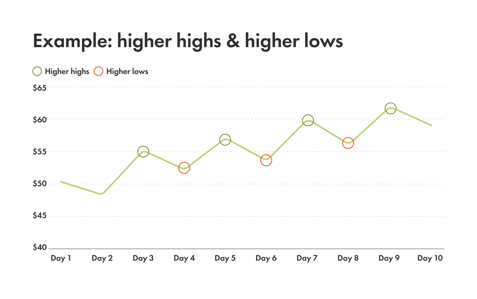
When you see this sequence consistently, buyers are in charge and pushing prices up.
Lower Highs & Lower Lows (LH & LL)
This pattern reveals a bearish (downward) structure.
Lower Highs: after a bounce, the price failed to reach the level of its previous peak.
Lower Lows: the price has fallen below its previous low.
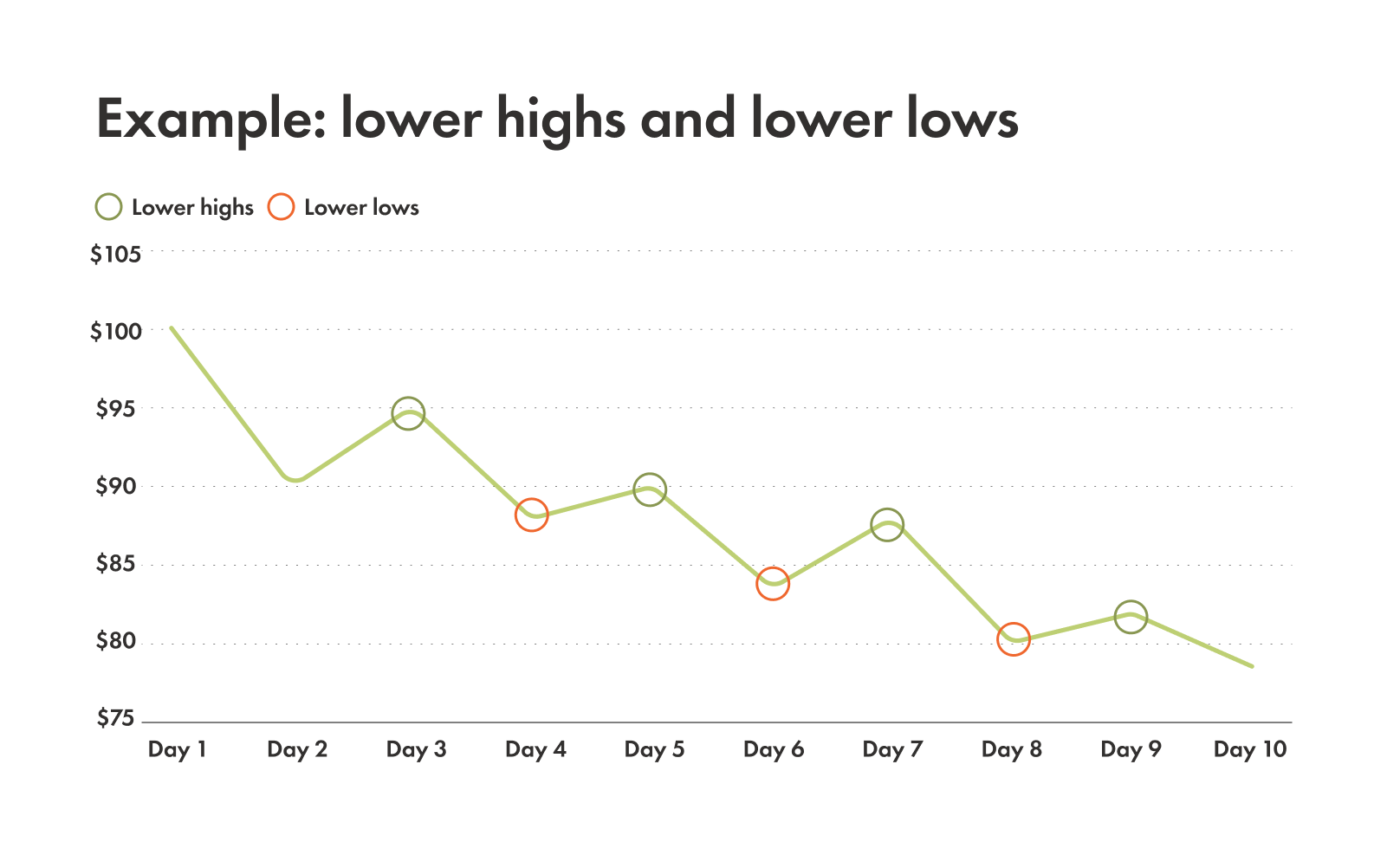
This sequence shows that sellers are in control and driving prices down.
A trend is generally considered intact as long as its corresponding price structure holds. For example, if you're in an uptrend and the price suddenly makes a lower low, that's a sign that the uptrend might be weakening or even reversing. Traders use these shifts in price structure to get a better sense of when to buy or sell a stock.
Common pitfalls with trends and avoiding them
While identifying trends with technical analysis is incredibly useful, it's not guaranteed. There are a few things to keep in mind to avoid common missteps:
Trends can be fickle
Markets are influenced by a constant barrage of news, economic reports, and investor sentiment. A trend that looks solid one day can shift surprisingly quickly due to an unexpected announcement or a sudden change in market mood. Always be prepared for the unexpected.
Drawing trendlines is subjective
While there are rules, the exact placement of a trendline can sometimes feel a bit subjective. What looks like a perfect trendline to one person might be slightly different for another. Aim for a clear representation of the general direction and focus on consistency.
Don't put all your eggs in one basket
Trend identification is best used as part of a broader strategy. Relying solely on trendlines or higher highs/lower lows is like trying to build a house with just a hammer. Combining trend analysis with other tools like trading volume (how many shares are being traded), technical indicators (mathematical calculations based on price and volume), or candlestick patterns (visual representations of price movements) gives a more complete picture. The more information you have confirming a trend, the more confident you can be in your analysis.