News
Please Ogle the New Totally Redesigned Wealthsimple Website
Check out our second (actually third!) chance at a first impression
Wealthsimple makes powerful financial tools to help you grow and manage your money. Learn more
What do you do when you win the Webby Award for best financial-services website? You tear the whole thing down and start from scratch, of course. That’s what we did, anyway. Our goal at Wealthsimple is to constantly evolve, to get better and more beautiful and simpler to use. We see our homepage as the first glance in what we hope will become a relationship that lasts a lifetime. So that first impression is pretty crucial.

Sign up for our weekly non-boring newsletter about money, markets, and more.
By providing your email, you are consenting to receive communications from Wealthsimple Media Inc. Visit our Privacy Policy for more info, or contact us at privacy@wealthsimple.com or 80 Spadina Ave., Toronto, ON.
We know what we do is different—it’s hard to explain automated investing to someone who’s never heard the phrase automated investing, let alone to someone who's never invested a penny. So when we started thinking about our redesign, we wanted to make a site that provided information as simply, clearly, and beautifully as possible. And we wanted a central metaphor that was fun, elegant, and the opposite of tech-confusing.
So we went with a Rube Goldberg machine. Yes, yes, we know a Rube Goldberg machine is an overly complicated contraption to achieve a simple task. But that’s part of the humour. Because we see what we do as something very simple designed to achieve a really complicated task.
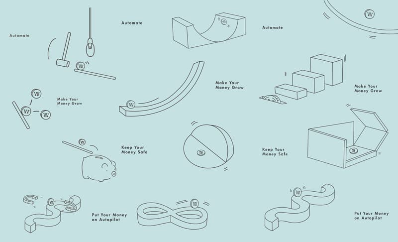

After countless rounds of sketches, we enlisted the help of one of the world’s top 3-D animation houses, ManvsMachine. We worked with their team of artists to create a new visual language of simplicity that was also human and approachable. We liked the idea of illustrating the techy guts of our investment service with something from the real world, something tactile that looks like you could reach into your screen and touch it. We got a little obsessive. We wanted coins with the perfect golden lustre, wood that feels textured and dimensional, and of course lots of airy white space.
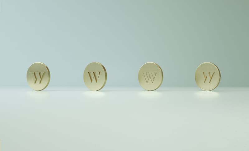
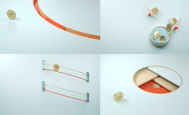
The homepage tells the story of a coin’s journey to prosperity. The machine starts the coin on its trip, and you follow its path. Coins jump and plonk and pull you along to the next simple bit of language to help users understand what Wealthsimple does. Just the information you need and never extra noise you don’t need—the point of what we do is to make things easier, not to overwhelm or even to brag about our math. Sorry, Wealthsimple engineers. Not everyone finds algorithms sexy.
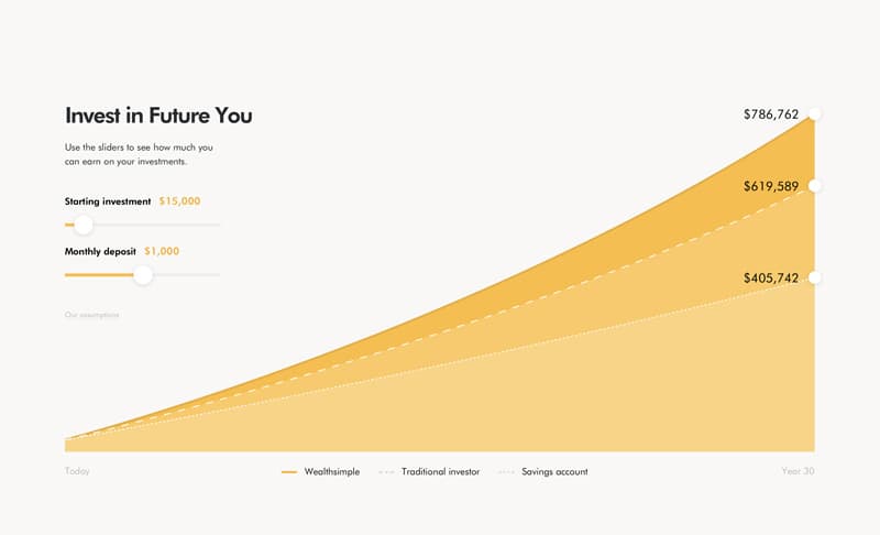
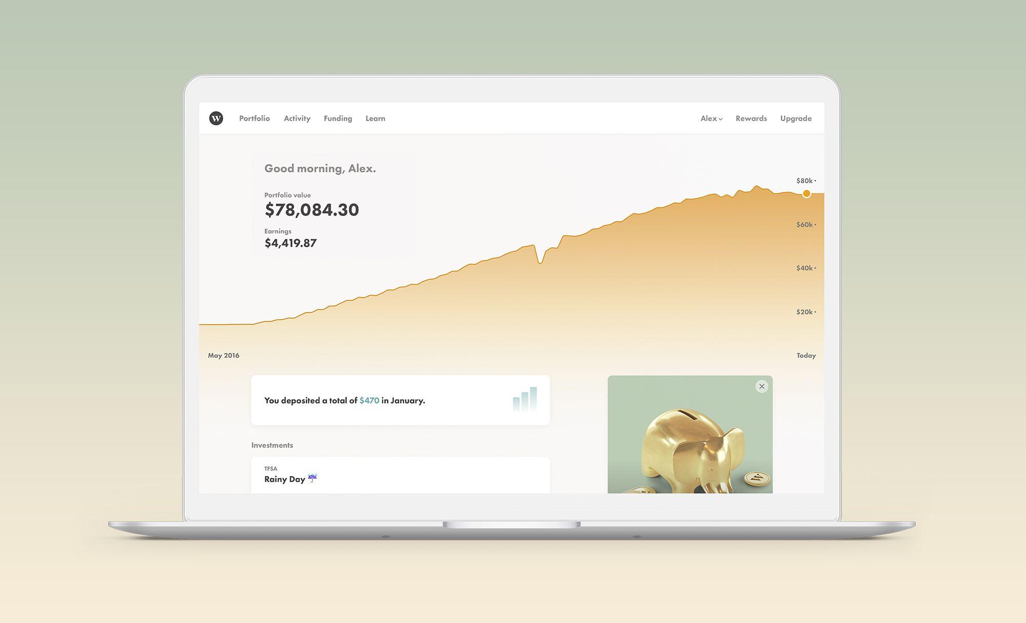
We’ve worked hard with our partners, Doberman and Varvet, to design and develop a product than can save our clients hundreds of thousands of dollars in fees over the course of their lifetime. It’s a big part of the reason we got into this business. And now clients can see what that savings will look like in our clear projection graphs that compare Wealthsimple with a traditional advisor.
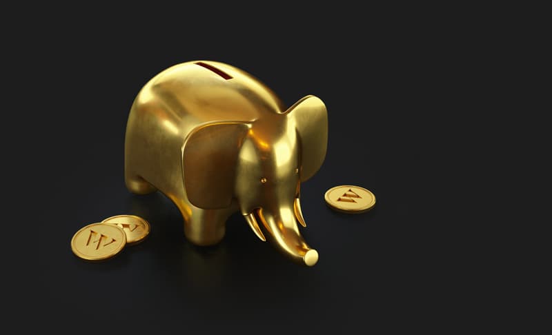
When we relaunched our homepage, we also introduced a new service: Wealthsimple Black, for clients who invest at least $100,000. While the point of Wealthsimple is to be a truly effective platform for anybody, we’re able to offer lower fees when you invest more with us—at $100,000 our fees go down to .4%. And Black clients also get access to Priority Pass airport lounges around the world.
When you think about an investment company’s website, the words “beautifully abstract” or “artful” may not come to mind. But we hope they will now. Because we’re a company that uses smart technology and simple design to make really confounding things easy to understand. We hope that after checking out our new site, you’ll want to be a part of that and start taking that same journey to prosperity as our coins.
Wealthsimple's education team is made up of writers and financial experts dedicated to making the world of finance easy to understand and not-at-all boring to read.

