News
The Wealthsimple Experience Is About to Get Even Better
When you log in to Wealthsimple in the next week, things are going to look a little different. Our new experience gives you a clearer picture of where you are, so you can make better decisions about where you want to go.
Wealthsimple makes powerful financial tools to help you grow and manage your money. Learn more
What’s the most important thing when it comes to putting your money to work? Oh, you might say, I know this one: the stock market! No? Is it interest rates? The ten-year treasury yield?? No no and nope. The most consequential thing you can do for your money is to control what you can control. Like keeping your fees low. Like making sure your portfolio is well-built. Like — and this is actually the most consequential thing you can do — investing your money regularly, regardless of what the market is doing.
It’s a simple concept, but it’s one that can elude even the most experienced investors. And we want to make sure it doesn’t elude you, our clients. So we’ve begun to evolve the whole Wealthsimple experience to make those things you can control front and centre — while putting the background noise in context so it’s not too distracting.
Here’s a short guide to what’s changing, and how it’ll make you a better money person — really!
A New Snapshot Of Your Portfolio
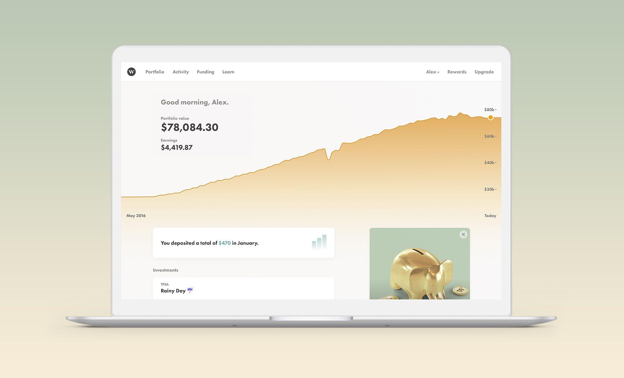
The first thing you’ll see when you log in to the new Wealthsimple experience is a brand new dashboard. We’re changing the emphasis from the short term to the longer-term, so you get more context about the financial road ahead. You can see what it’ll look like, below — you know, that pretty marigold-coloured graph that climbs up and to the right.
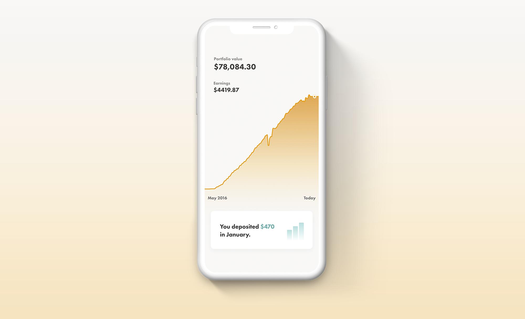
The new dashboard page gives you a longer-term, bigger picture view of how you’re doing and where you’ve been than before. That’s purposeful. Why? When your view of the world is overly short-term, it causes problems for the long-term investor. You may, for instance, feel you need to make dramatic changes right away — buy! sell! — when it’s much more effective to ignore short-term market gyrations and stick to your plan.

Sign up for our weekly non-boring newsletter about money, markets, and more.
By providing your email, you are consenting to receive communications from Wealthsimple Media Inc. Visit our Privacy Policy for more info, or contact us at privacy@wealthsimple.com or 80 Spadina Ave., Toronto, ON.
We’re also putting more emphasis on what you can control, like your deposits and withdrawals. Wealthy or not, young or old, every client can use a reminder that simple acts, like saving a little extra, often have a much bigger effect on your financial future than even how the stock market performs. To that end, there’s a new deposit-tracking tool (you'll find it right underneath the new graph) that shows how much you’ve contributed each month, and your average contributions over the last six months, to help keep you on course for your goals.
A Better Vision of the Future
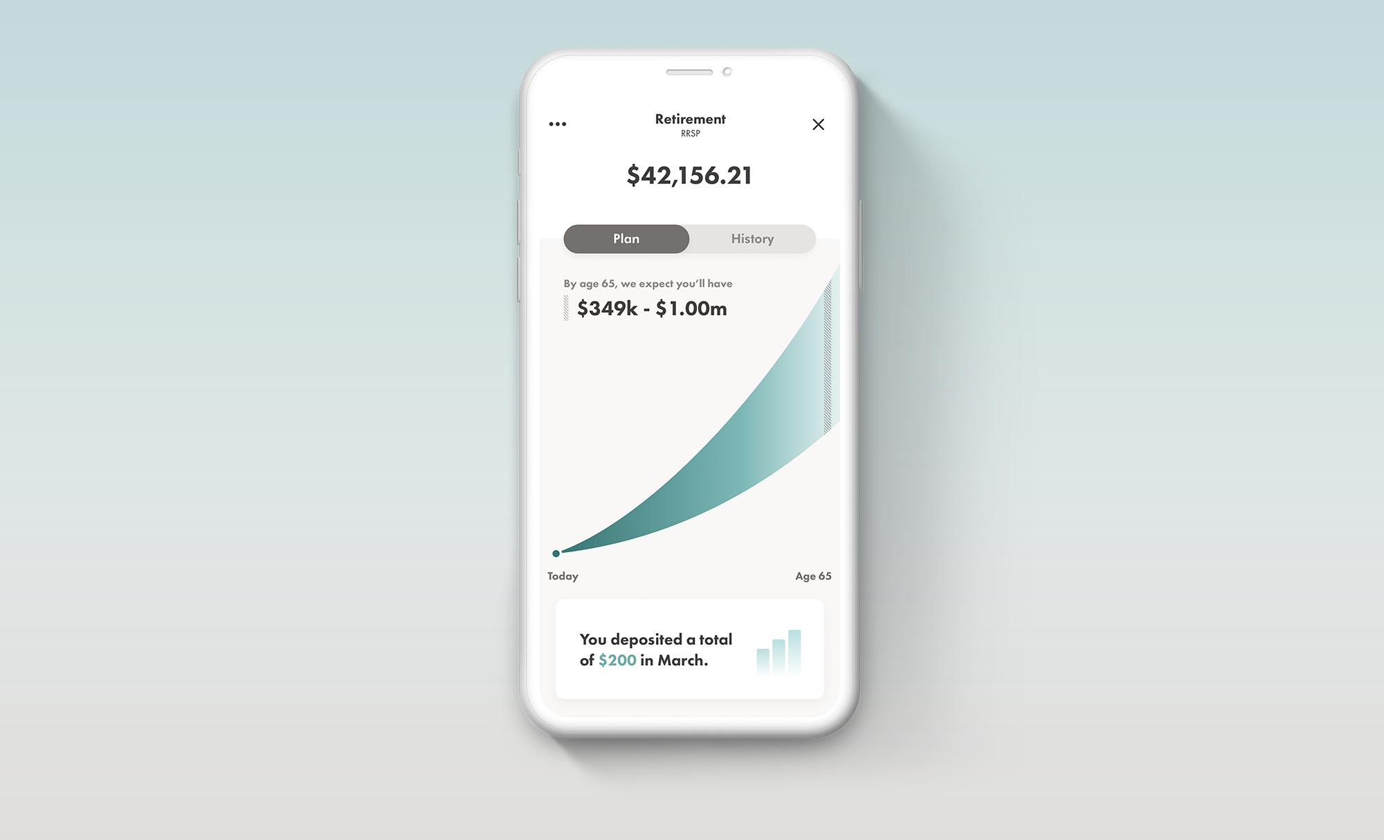
Getting an idea of what your financial future might look like is a pretty valuable thing, too. But not all projections are created equal. We’re changing ours to make it more transparent and informative. In the old view we projected the most likely future value of your portfolio as an actual number, down to the cent.
That kept things simple, but some people got the impression that we were giving them a literal and precise projection of the future. Which, of course, isn’t the case. (A good rule of thumb when shopping for financial services: never trust anyone who says they can predict the future.) In our new graph — which you can see below — we’ll provide you with an informed view of the probable range of outcomes, based on the risk level of the portfolio and how markets have performed in the past. Because it’s important for you to be able to plan for the whole spectrum of possible outcomes.
Here’s what it’ll look like:
We Redesigned the Way We Show the History of Your Account
Lastly, the way we show your account history is going to change. This is how it'll look:
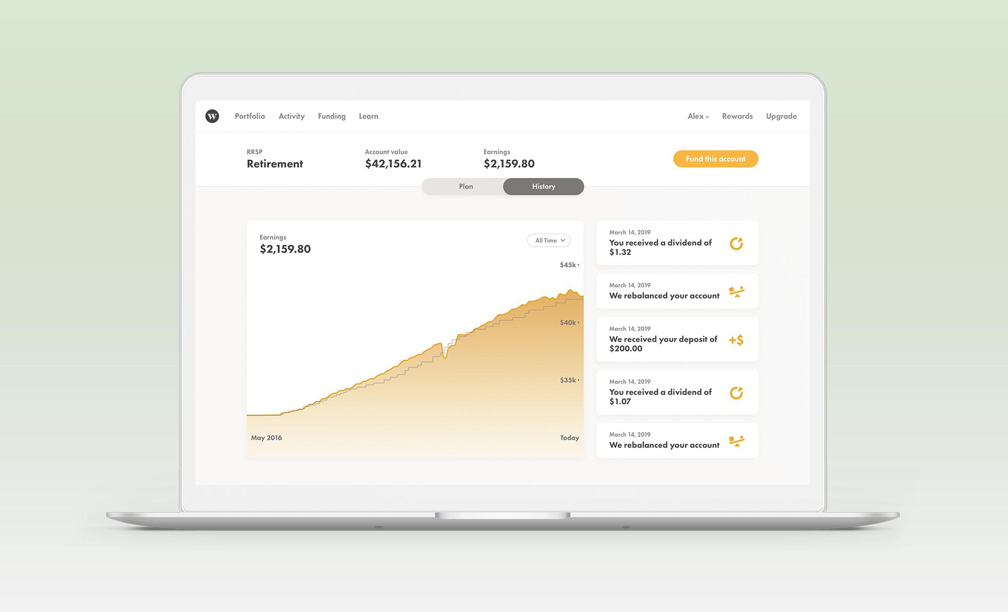
The dark grey line reflects your net deposits — when it goes up, that means you put more money into your account (in case we haven’t already made it extremely clear: the importance of keeping up regular deposits to your long term growth can’t be overstated). The shaded yellow part of the graph represents the value of your portfolio at a given time. When that yellow line is above the grey one, it means your portfolio has earned money above and beyond what you’ve put in, thanks to market performance. And when it’s below, it means the market has pulled you into negative territory.
To the right of that graph you’ll also see a snapshot of your recent account activity. For instance, if we’ve recently invested a deposit, or if you’ve received dividends or been charged a fee, this is where you’ll see it.
A Better Snapshot of Performance
When it comes to performance, let’s start with a quick reminder: if you’re investing for the long term, looking at how much you’ve made or lost day-to-day shouldn’t be your top priority. But knowing how you’re doing is an important part of investing, and to make sure you’re getting the best, most accurate picture of your portfolio’s performance, we’re making three improvements.
First, you’ll be able to see each account’s performance separately. In the past, your performance was shown as a single, consolidated number that combined all your accounts. That keeps things simple, but it can be misleading. When you can see the performance of each account separately, you’ll get a clearer sense of how you’re doing. After all, your retirement account likely has a riskier mix of assets — and a longer timetable — than the account you’re using to save for a house (or another shorter-term goal) in the next few years.
Second, you’ll be able to see your performance in an annualized way. Until now, your numbers reflected your accounts’ performance since you began investing with us, even if that was years ago. Now, you’ll see what the yearly rate of return is for each account.
Third — and last! — we’re updating your earnings and returns more often. Every 15 minutes to be exact. So you always have the most up-to-date information.
And There's More to Come!
One of our founding principles at Wealthsimple is that we’re always in beta. That means nothing is set in stone, and everything is always improving. We have more tweaks and refinements already in progress, like a new tool to help you set up milestones — and of course to congratulate you when you reach them.
Sure, you could argue that all this stuff is just change in design. But visualization is a useful way to understand how investing really works — and to inspire you to do it wisely and consistently. And of course good design makes things simpler. Which, as you know, is something we like.
Wealthsimple's education team is made up of writers and financial experts dedicated to making the world of finance easy to understand and not-at-all boring to read.

