News
Introducing the new Wealthsimple
Taking a human approach to automated investing
Wealthsimple makes powerful financial tools to help you grow and manage your money. Learn more

Sign up for our weekly non-boring newsletter about money, markets, and more.
By providing your email, you are consenting to receive communications from Wealthsimple Media Inc. Visit our Privacy Policy for more info, or contact us at privacy@wealthsimple.com or 80 Spadina Ave., Toronto, ON.
Today we’re unveiling our new brand identity, and as you can see it’s much more than just a new logo.
Every day we’re focused on helping people understand why they invest and simplifying how they invest. But when we took a step back, we didn’t feel like the ‘why’ was coming through strong enough in our brand. So we set out to redesign our visual identity–logo, typeface, colour scheme, websites, mobile apps, and blog–to show the role investing plays in our lives.
Human
We decided early on that we wanted to make investing more human. Money can be cold, and financial institutions don’t do a whole lot to help. They show us a lot of charts and talking heads in suits. And when we do see real people, they’re not very real at all. It’s usually cliché stock photography, like business owners with their arms crossed. Why are their arms always crossed?
We designed the new look and feel around real photography. Most of the photos we use are from our friends–real people just like the ones who use our product. Whether it’s saving for that dream cottage on the lake or making sure your kids go to college, we show that money is just an instrument to live a better life.
Warm
Our new colour palette is warm and inviting, a drastic departure from the icy blues and greens of traditional banks. Somebody must have published a paper saying blues make people feel safe and greens make people think about money, because 90% of finance brands (based on our sampling) use some combination of them as their dominant colours. We fell into the same trap, and we lost our ability to have a unique voice.
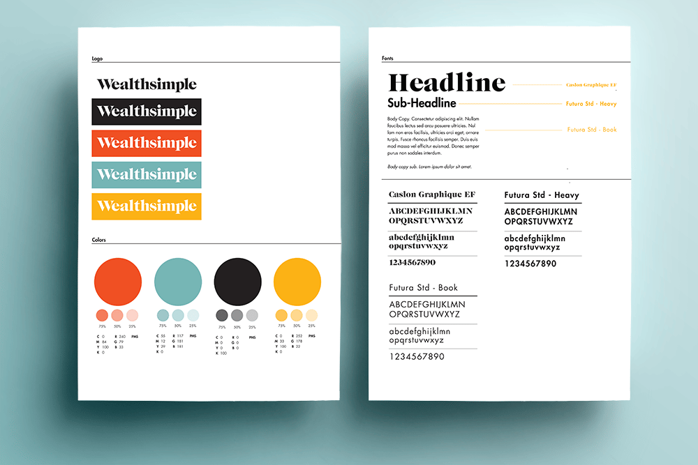
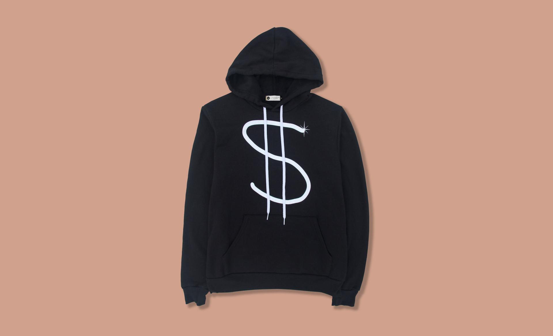
Our new colour palette features rich yellows and warm reds. We use a mix of primary colours (blue, red, and yellow) but updated them to feel a little more contemporary. Our typography uses the timeless Caslon and Futura typefaces to convey the security of your money, but we treat type in a way that is fun and approachable.
Simple
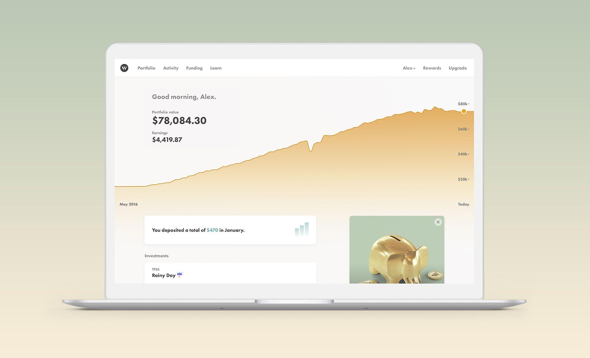
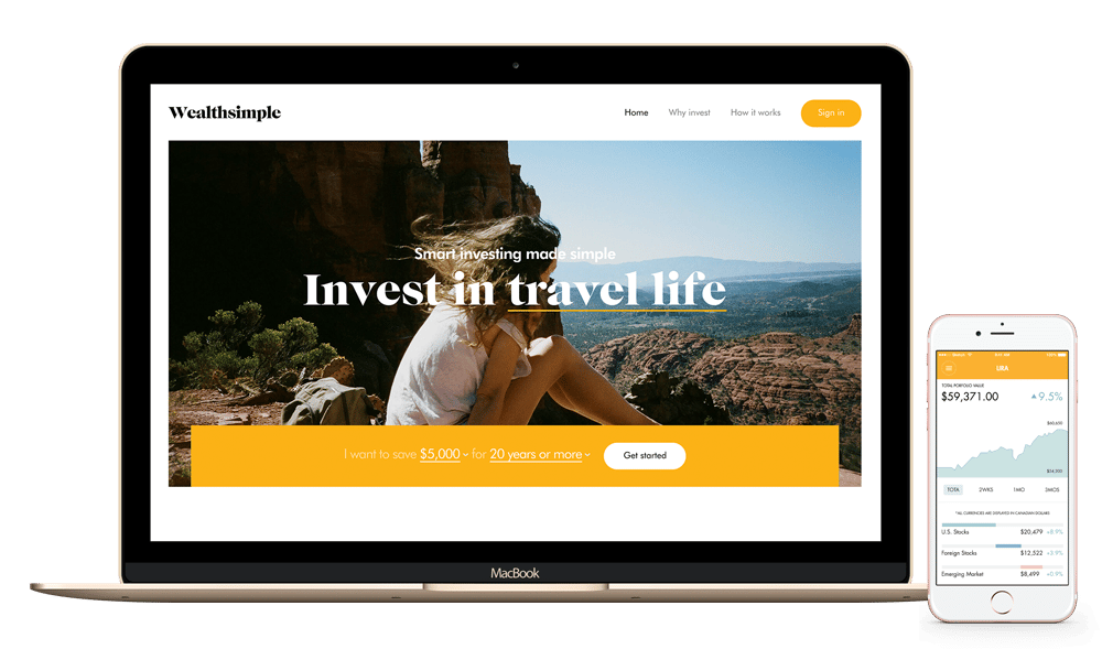
Our streamlined new website is simpler than ever. Unless you’ve read up on "modern portfolio theory"or you're really good at Excel, smart investing can get complicated. Concepts like diversifying, rebalancing, and "tax-loss harvesting", can easily scare someone into never investing in the first place. If we're going to make investing accessible to everybody, we have to keep making our user experience simpler.
Smart
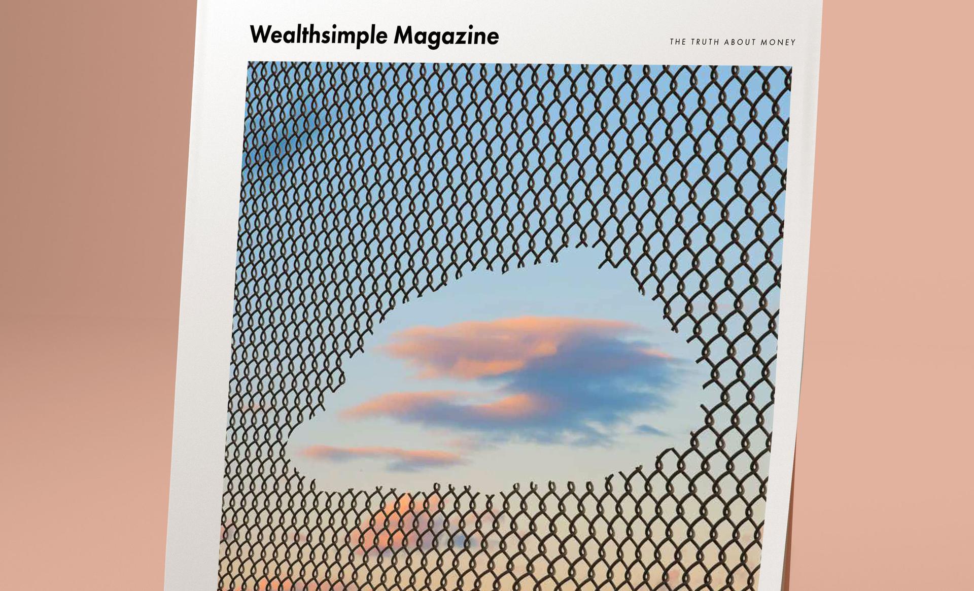
And finally, we’ve also totally reimagined our blog. We’re calling it "Grow" because we hope it helps you be a better you. We’re introducing two new columns next week. Money Diaries is a series of first-person essays from celebrities and interesting personalities about what they've learned about money in their own lives. Stay tuned for diaries from the likes of Elizabeth Gilbert (author of Eat Pray Love), Alex Blumberg (founder of Planet Money), and Charles Adler (founder of Kickstarter). How To is a series that teaches you, well, how to do things. This is just the beginning; we will be introducing more columns next year.
Going Forward
Ultimately, Wealthsimple isn’t about a new colour palette or a new logo. It’s about helping you, our clients, grow your nest egg so you can get on with your life and accomplish your goals. We’re doing everything we can to live up to the trust you place in us every day.
Wealthsimple's education team is made up of writers and financial experts dedicated to making the world of finance easy to understand and not-at-all boring to read.

